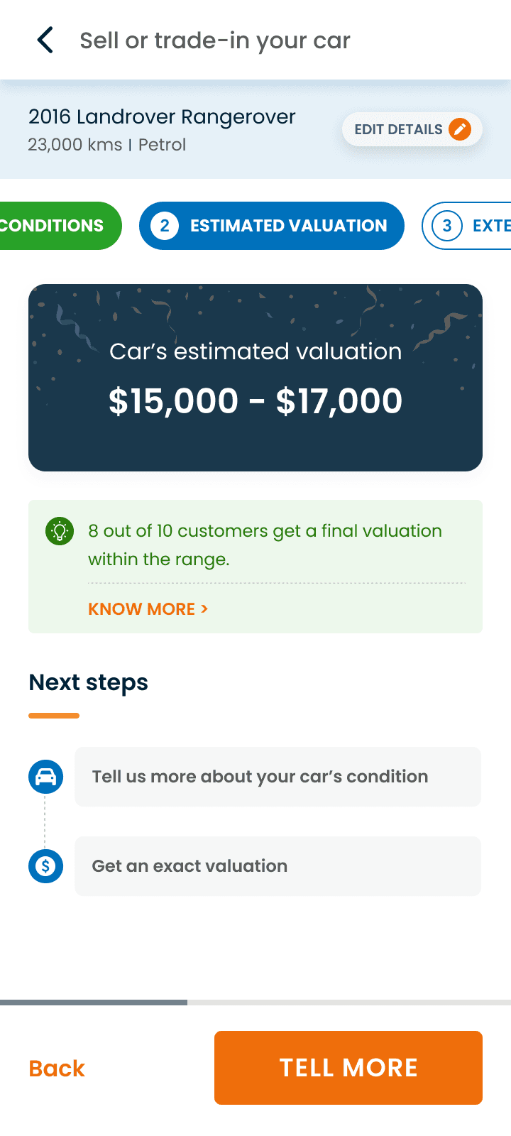
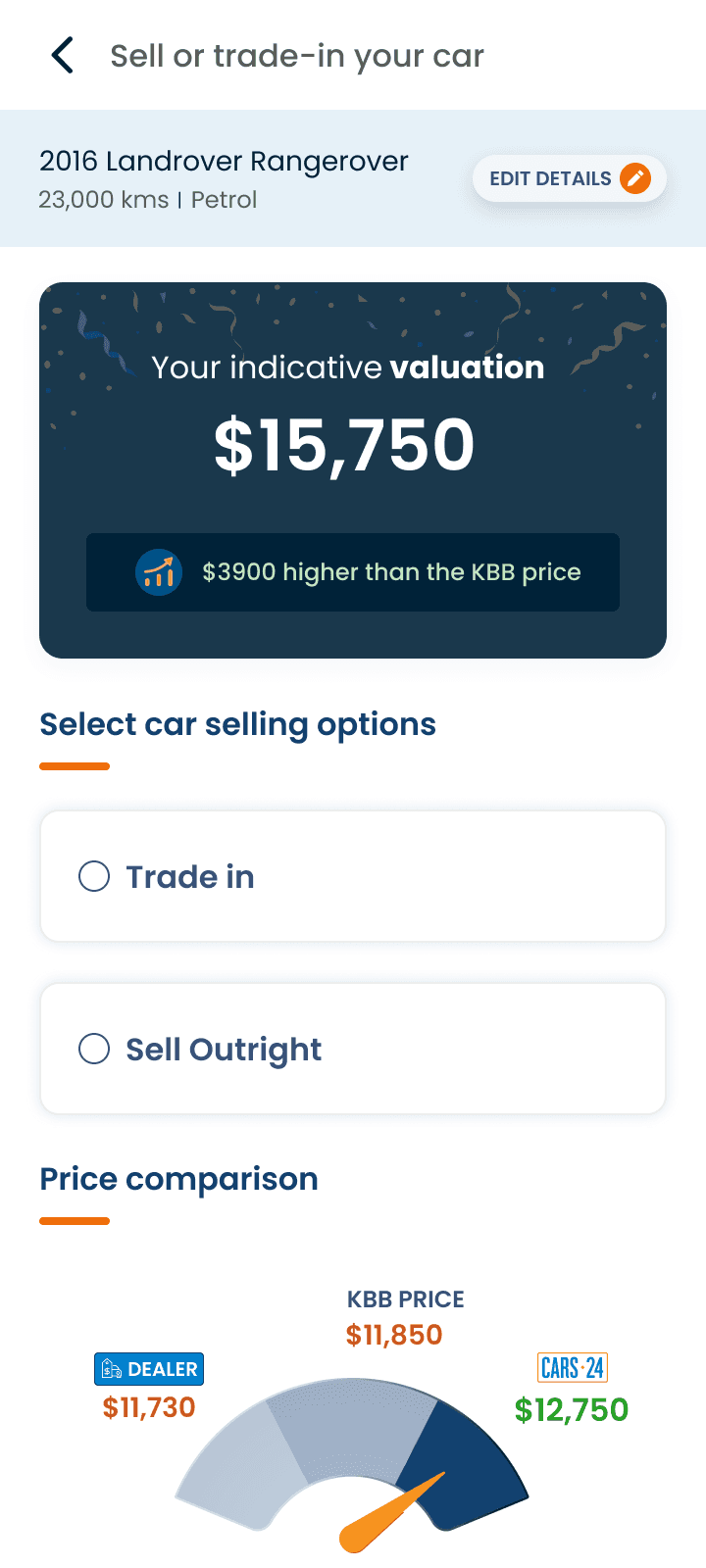
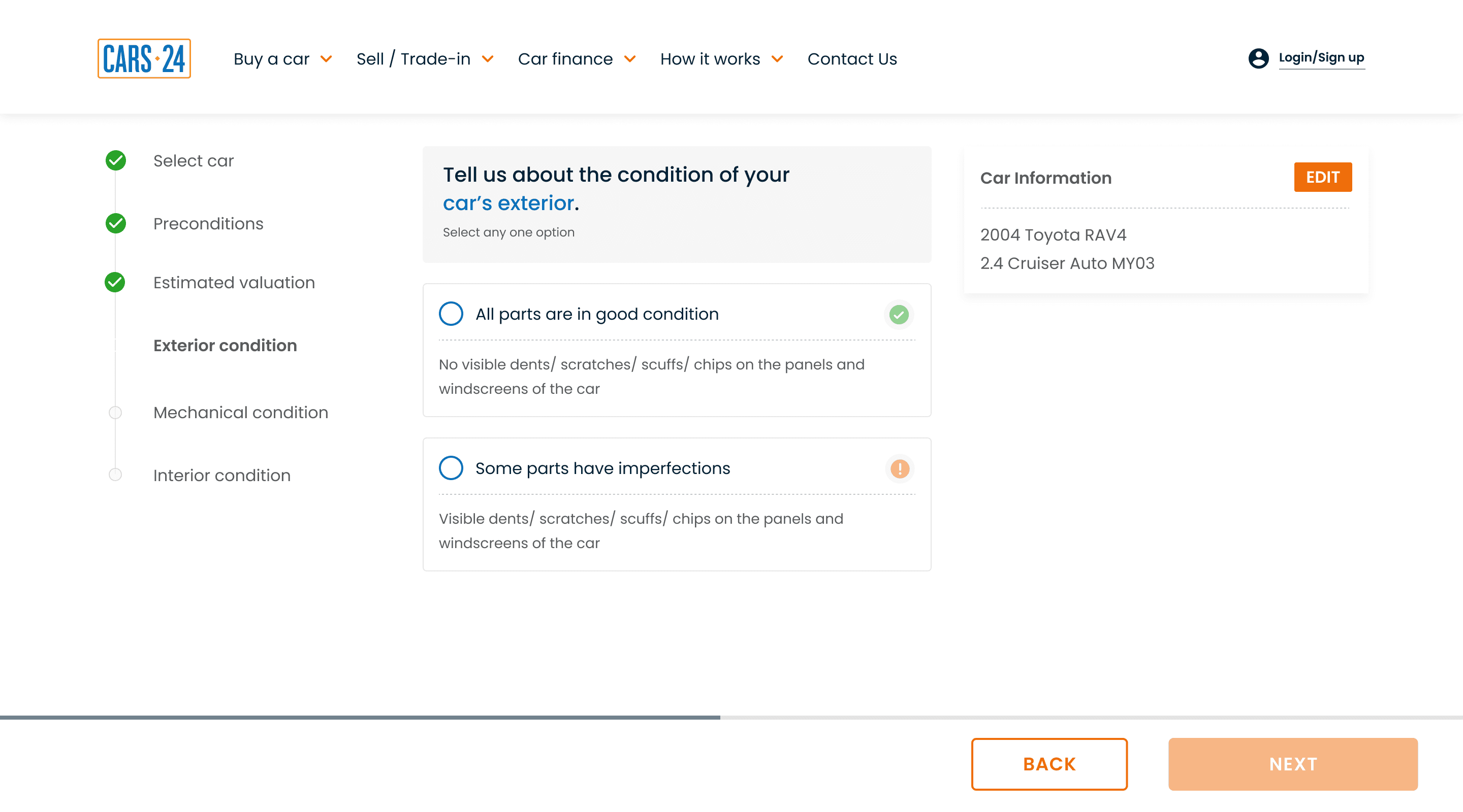
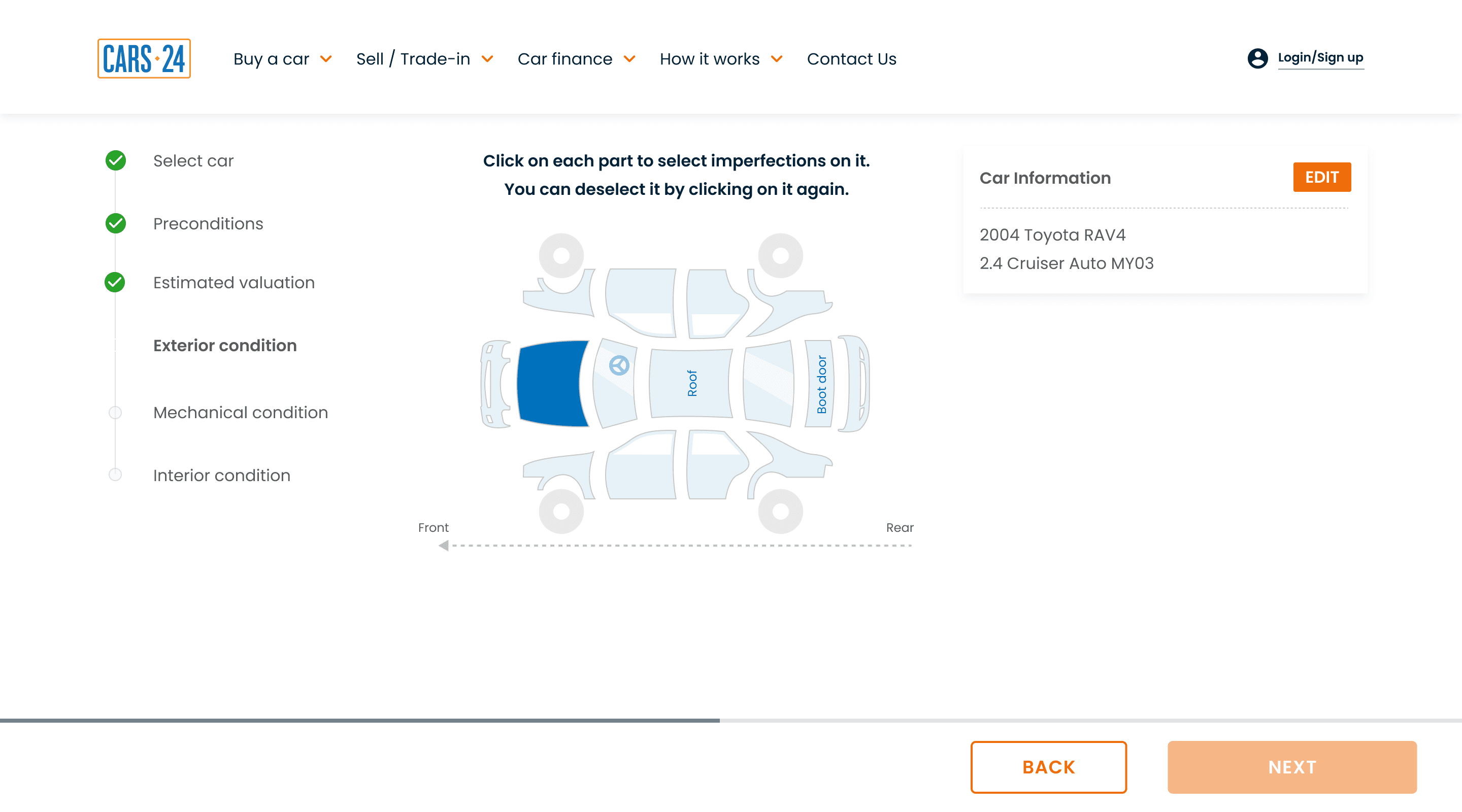
CARS24 lets people sell or trade in their used car online. You describe your car, get a price estimate, then have it checked and collected from your home. That online price can change after the car is assessed, so people need to trust it before they commit.
Only 9.2% of people who got an online price for their car went on to book an inspection. A redesign of CARS24's car-selling journey raised that to 16.5% in a one-month A/B test.

Impact at a glance
Booked an inspection after seeing a price
Tested as a 50/50 A/B test, Sep 2023, for one month.
Problem Statement
Before the redesign, 62% of users reached a price for their car. Of those, only 9.2% booked an inspection, about 1 in 11. People answered 4–5 questions about their car, got a price, and then mostly walked away. They didn't trust it.
They weren't casual browsers. Each had spent 5–7 minutes answering up to 5-7 questions. The price page itself worked and plenty of people reached it, yet almost all of them stopped there.
I owned this end to end, from problem discovery to shipped design.
I dug into the problem through user calls and data, worked with business stakeholders to understand how car valuations are priced, and aligned with product and engineering on scope. I then redesigned how people describe their car's condition and added trust-building details to the price screen, and validated both through prototyping and user testing.
The Product in 30 seconds

Car condition Q/A

See car price
Book inspection

Sell car/trade-in
A car valuation is an estimate. The more accurately someone describes their car's condition, the closer it gets to the price they'll actually be offered. That link between how well people describe their car and how much they trust the price is what this project is about.
What users said
Research Goal
Understand why people who received an online valuation didn't go on to book an inspection, and what would make them trust the number.
Method
Customer calls: 35 calls of 3-5 minutes each, used Hubspot tool to collect customer contact number. All of these customers saw the valuation but didn't book inspection
Who: users in Australia aged 25–65
Run by: Me

Mark Jakson, 32
Melbourne

Camille Williams, 34
Sydney

Amy Lacorthe, 48
Melbourne
A few basic questions weren't enough to describe a specific car, so the price felt generic, and with no explanation of how it was calculated, people had no reason to trust it.
Turning the insight into design problem
I split the problem in two and aligned with product managers, business stakeholders and engineers. This case study goes deep on Problem B.
User Problem A: Transparency
Users doubt the car valuation number
Direction: Add trust-building details to the price screen
User Problem B: Information gap
Users feel they haven't told us enough
Direction: Ask better, more detailed questions about the car's condition
Why the questions? They are the one moment where users tell CARS24 about their car, so it's where accuracy is decided, before any price appears. If people feel they described their car properly, they're more likely to believe the number that follows.
The tension I designed around: Asking for more detail risked making a journey that already took 5–7 minutes even longer. My bet was that people will put in more effort if it clearly leads to a fair price.
How we'd know it worked: The main measure was how many people booked an inspection. Secondary measures were reaching a price, time to complete and question completion. To credit any change to the design rather than seasonality or traffic, we ran a 50/50 A/B test.
Design V1: what to ask, and how
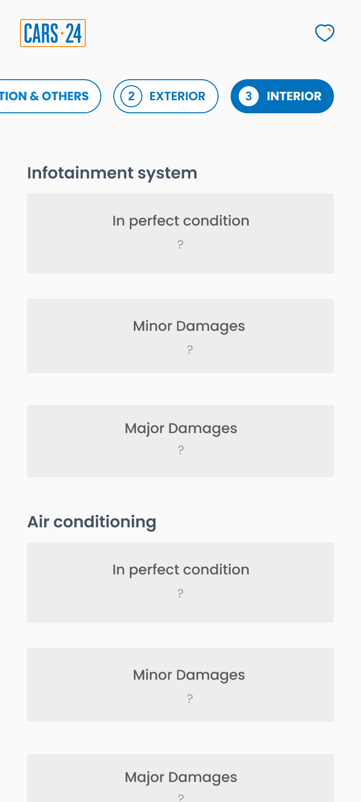
I listed every question needed to price a car fairly and grouped them into car details, exterior, mechanical and interior validated by business stakeholder. Created rough sketches on paper and moved to hi-fidelity wireframes once I had the structure. Discussed the wireframes and questionnaire structure with business and product teams before jumping into the final designs.
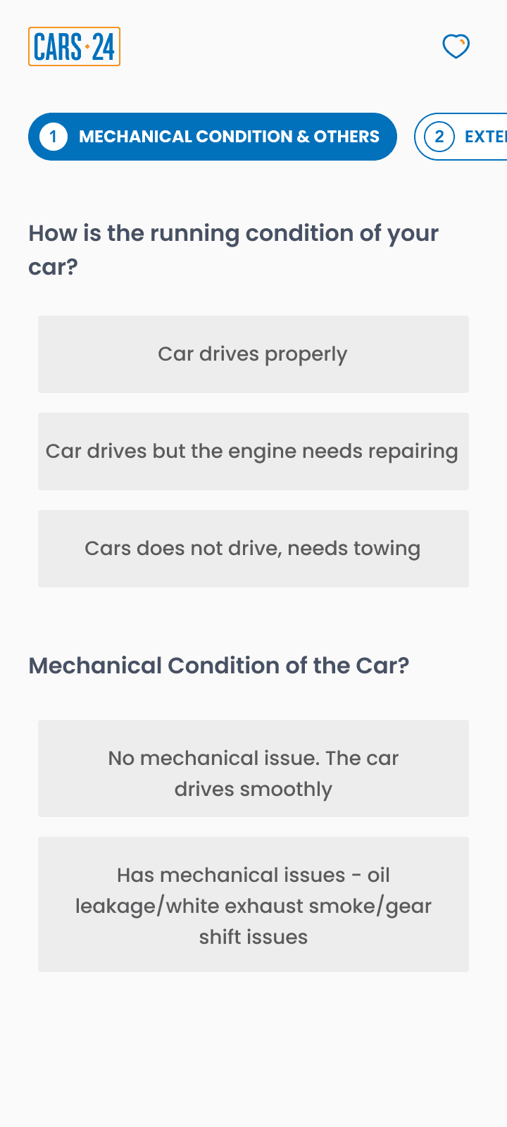
Here's a quick snapshot of wireframes and version 1 design that I tested with real users using User Testing platform:






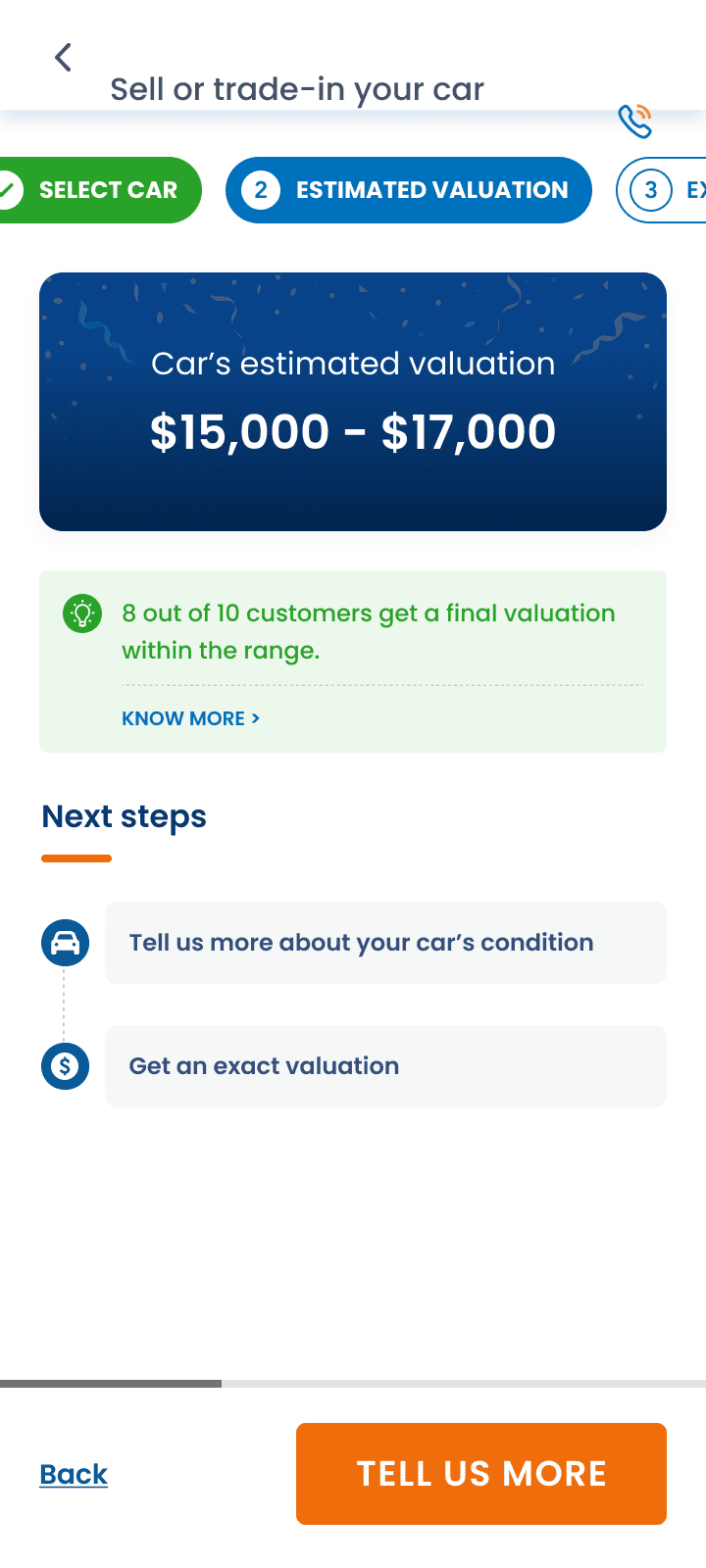

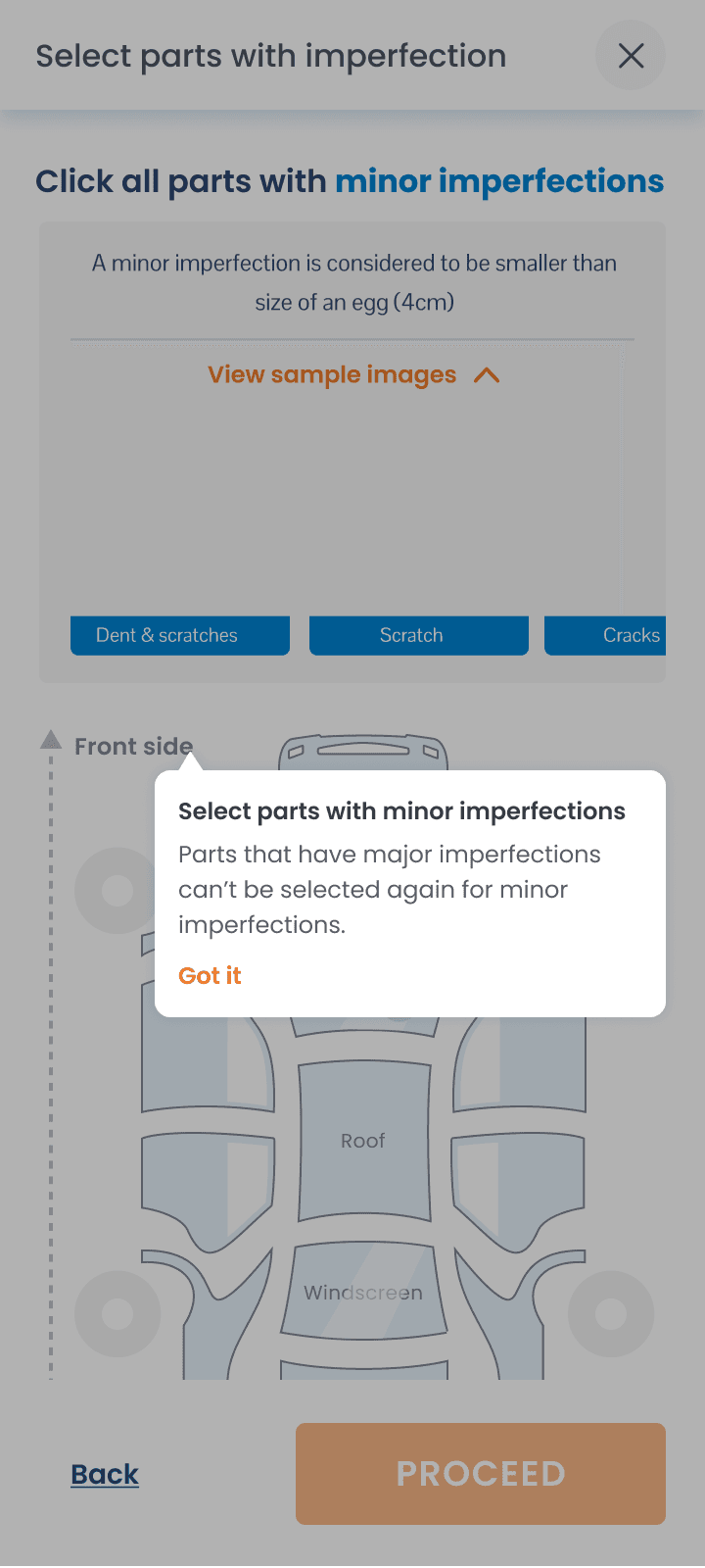


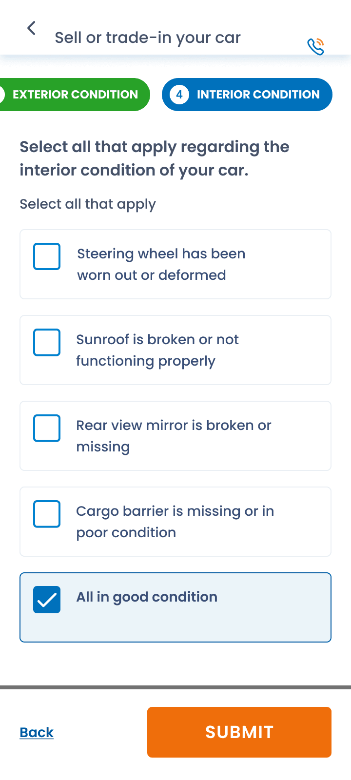


See end to end high fidelity testing prototype on Figma

View Prototype
Three design decisions:
A progress stepper (Select car → Details → Estimated price → Exterior → Mechanical → Interior), so people can see how far along they are and the effort feels chunked.
An early price range (for example $15,000–$17,000) shown before the detailed questions, so users get something back before doing more work.
A car diagram for marking damage instead of describing it in text, in two passes: major damage first, then minor.
Three design decisions:
A progress stepper (Select car → Details → Estimated price → Exterior → Mechanical → Interior), so people can see how far along they are and the effort feels chunked.
An early price range (for example $15,000–$17,000) shown before the detailed questions, so users get something back before doing more work.
A car diagram for marking damage instead of describing it in text, in two passes: major damage first, then minor.
User testing V1
What I wanted to learn:
Do people understand the difference between major and minor damage, and can they select the damaged parts easily?
Do they understand why they first get a price range and not a single price?
Will they answer this many questions?
Method
Unmoderated test using high fidelity prototype using user testing platform:
Who: 15 users in Australia aged 25–65
Run by: Me

9 out of 10 users who completed the flow rated it "5 - Strongly agree" for being simple and easy to understand, even when they struggled on individual screens.
6 out of 10 users admitted they didn't read the on-screen instructions before selecting major or minor damage, several describing it as "clicking randomly" or skipping the prompt entirely.
4 out of 10 users confused two of the answer options in the major/minor selection, most often the last two choices.
7 out of 10 users said they were willing to answer more questions for a more accurate valuation, with several explicitly linking fewer questions to lower trust in the price.
3 out of 10 users asked for more detail or customization, such as manually entering specific damage, seeing their exact car model in the diagram, or adding service history percentages.

The flow felt simple. 9 out of 10 users who completed it rated the overall experience "5 - Strongly agree" for being simple and easy to understand, even when they struggled on individual screens.
People wanted to do more, not less. 7 out of 10 users said they were willing to answer more questions for a more accurate valuation, several directly linking fewer questions to lower trust in the price.

The major/minor rule wasn't applied. 6 out of 10 users admitted they didn't read the on-screen instructions before selecting major or minor damage, describing it as "clicking randomly" or skipping the prompt entirely.
Some wanted even more control. 3 out of 10 users asked for more detail or customization, such as manually entering specific damage or seeing their exact car model in the diagram.
People want to act, not read. Most users could state the major/minor rule when asked directly, but that didn't mean they applied it in the moment. The interface needed to carry the rule, not the instructions above it.
The Redesign: From reading rules to doing the task
The two-pass flow asked people to absorb definitions of "major" and "minor" damage on one busy screen before they could act. I explored two option to solve the same:
Option A: keep two passes and simplify the instructions.

Option B: one pass, where you tap a car part and classify it in a focused panel with the definition and photos right there.

The Final Journey