Verizon's Home Internet Sales Journey Audit
Verizon is a leading telecommunications provider in US offering mobile and home internet services to millions of customers. This project focused on auditing and prioritizing friction points across the home internet plan selection and purchase experience, laying the groundwork for the redesign that followed. FWA is Fixed Wireless Access and Fios is Fiber Optic Service.
Role
Duration
Tools
Team
Project Overview
Within the home internet sales portfolio, we conducted a comprehensive audit of the end-to-end customer journey, from initial address entry to final purchase. The objective was to systematically identify customer-facing friction points and foster organizational awareness through centralized, accessible documentation.
25
Total identified issues
3
Critical
4
High
18
Medium
Problem Statement
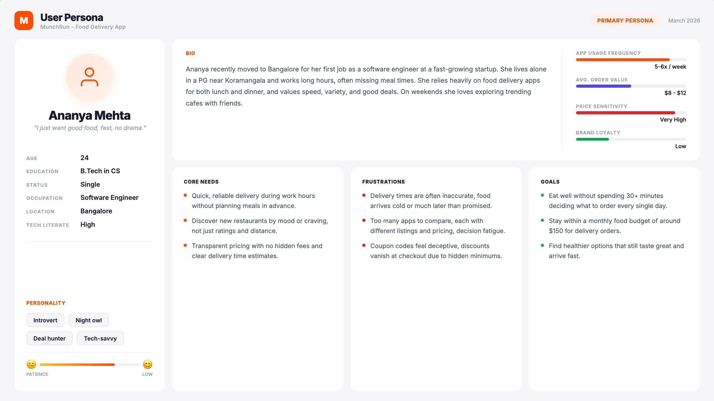
The home internet plan selection experience overwhelmed users with too many options, unclear jargon, and layouts that made comparing plans or finding key details difficult, especially on mobile.
Verizon's Mobile + Home bundle is a strategic priority — bundled customers show higher retention and Life Time Value. But the purchase experience across Mobile + Fios (Fiber Optic Service) and Mobile + FWA (Fixed Wireless Access) flows had never been holistically audited.
- Fios purchase experience has been built on legacy code bases that disables customer to buy Mobile + Fios in a joint cart although customers have shown strong intent to purchase both in same cart. (28.4% customers)
- Bundled purchase rates on Mobile+FWA were significantly lower (5%) than single-product flows, and customer sentiment on community forums pointed to recurring confusion and frustration.
Considering these scenarios, which are a mix of major and minor issues, the requirement from leadership was to capture all these issues in an organised and systematic manner so that it can be evaluated.
My Role
As Senior Experience Designer, I audited customer friction across the Mobile + Home and Home Internet sales funnel, uncovering both experience gaps and systemic UI issues. I turned these findings into clear, centralized documentation and worked cross-functionally to get leadership aligned on the problems. This case study covers that audit and prioritization phase of top 3 critical issues; the resulting plan tile and purchase flow redesigns are detailed separately.
Research & Discovery
Key Findings
67.8% of customers dropped off directly on the plan tile page; before even reaching the cart, signaling the friction starts at plan selection itself, not just at checkout.
Nearly all customers who reach the joint mobile and FWA cart leave without completing the purchase.
About 1 in 4 mobile customers eventually add Fios, but only through separate nudges over time, since a joint cart option doesn't exist for Mobile and Fios yet.
Intended Outcomes
Quantifying Customer Friction
Centralizing issue records revealed recurring friction patterns across the journey, exposing systemic risks that a piecemeal view had been hiding.
Enhanced
Prioritization
With every finding in one place, we could rank issues by severity and frequency, and put resources against the pain points that actually mattered most.
Informed Strategic Trade-offs
Centralized records made the "cost of inaction" visible, giving leadership clear evidence for what's at stake whenever new features get prioritized over fixing broken experiences.
User Flow
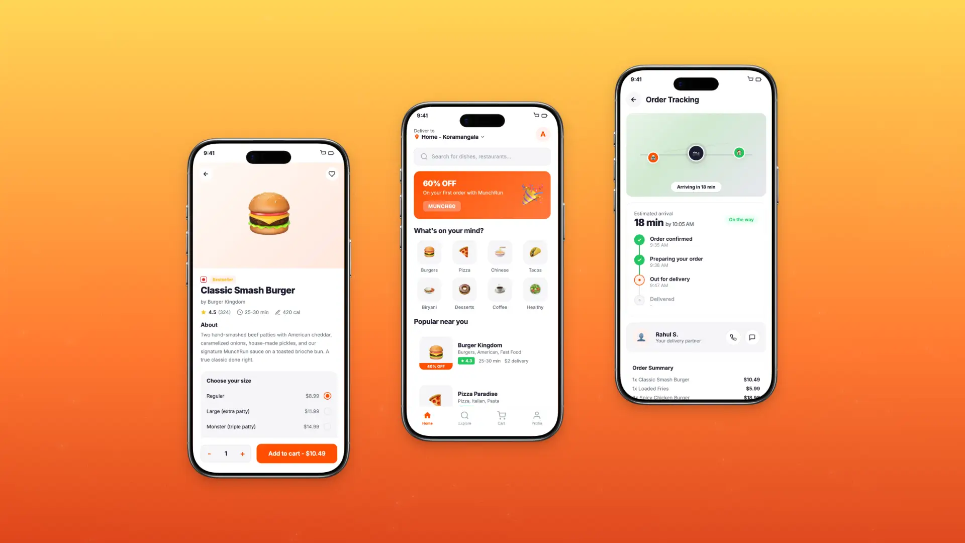
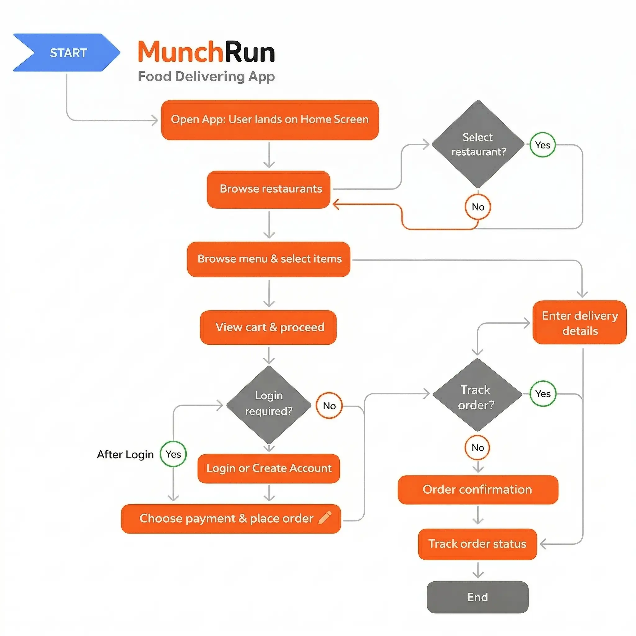
I mapped three primary journeys: new user discovery, repeat order, and live order tracking. The main goal was cutting the average order time from 6.8 minutes to under 3 minutes.
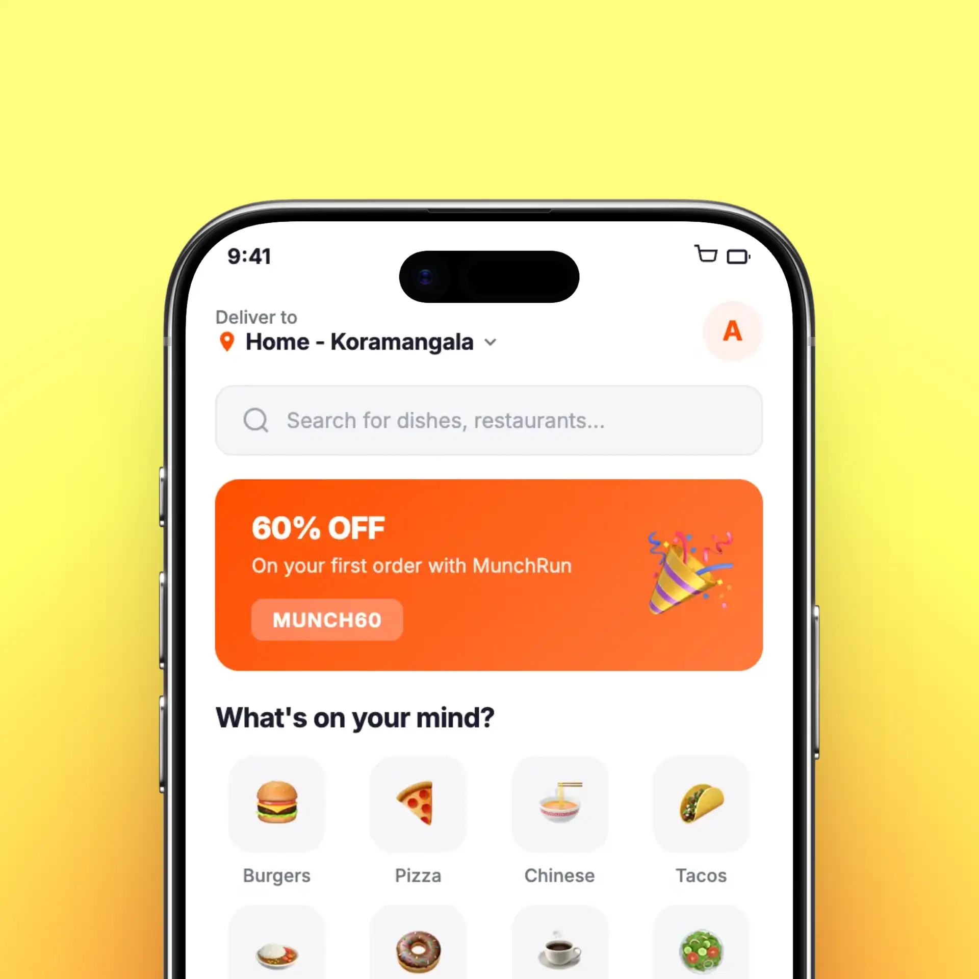
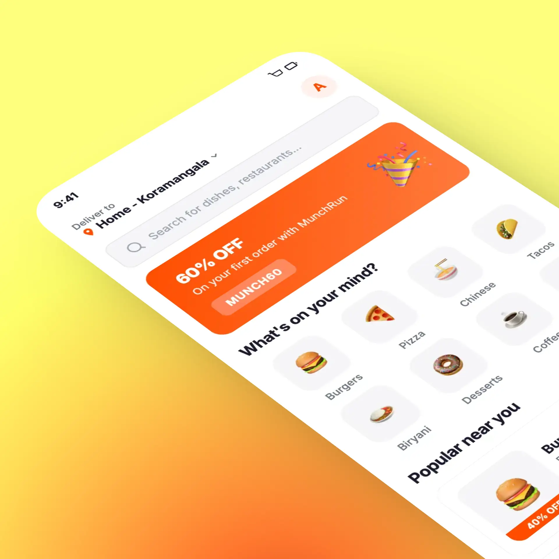
Discovery to cart - personalized feed with smart filters and restaurant cards showing live wait times
Customization to checkout - single-screen item builder with inline upsells and saved preferences
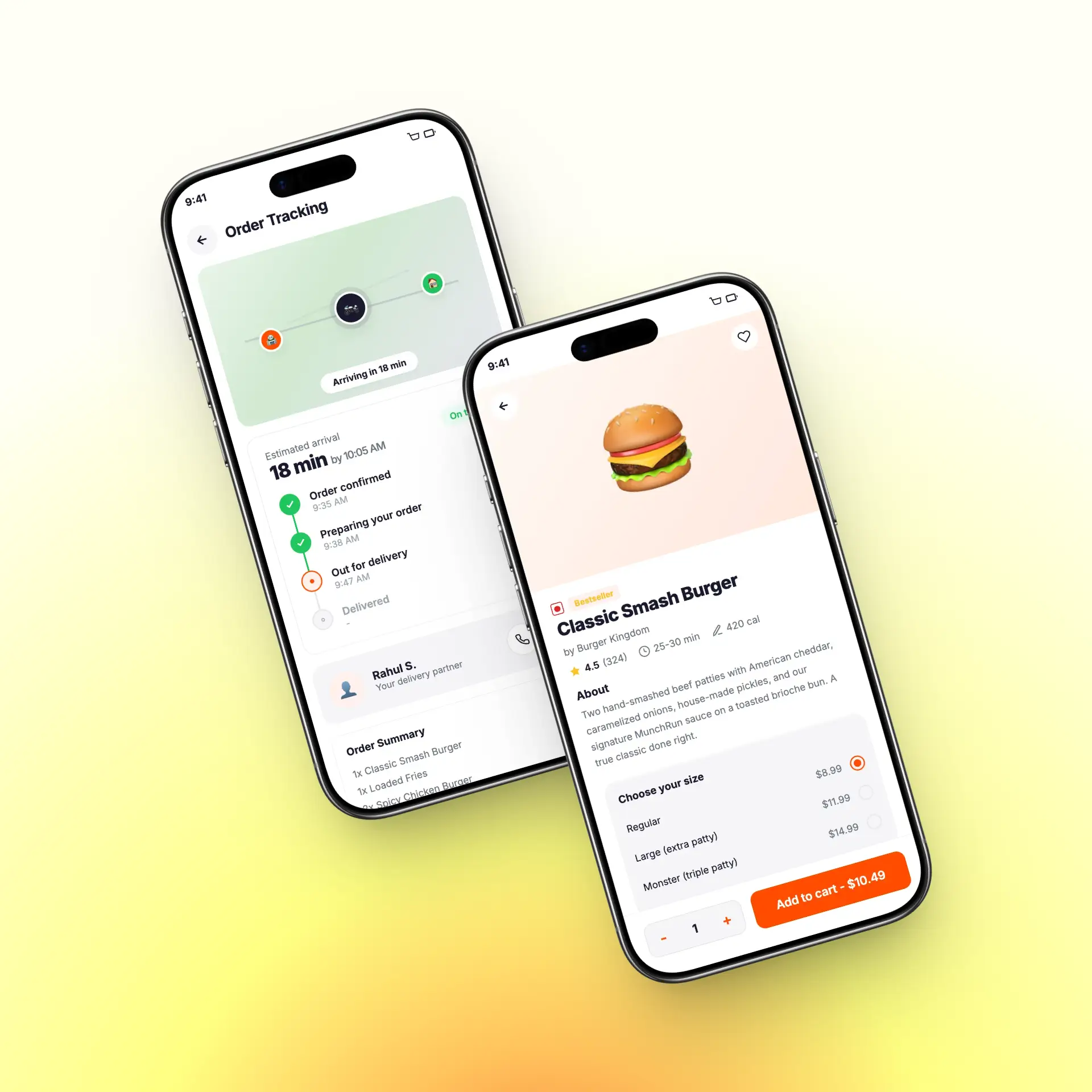
Post-order tracking - live map view with push notifications and estimated arrival countdown
Wireframing
I designed wireframes for 22 key screens, moving from rough sketches to mid-fidelity layouts across 3 iterations. Each round was tested with 6 participants via hallway usability sessions.
The final wireframes achieved an 88% task completion rate, compared to 51% on the original app.
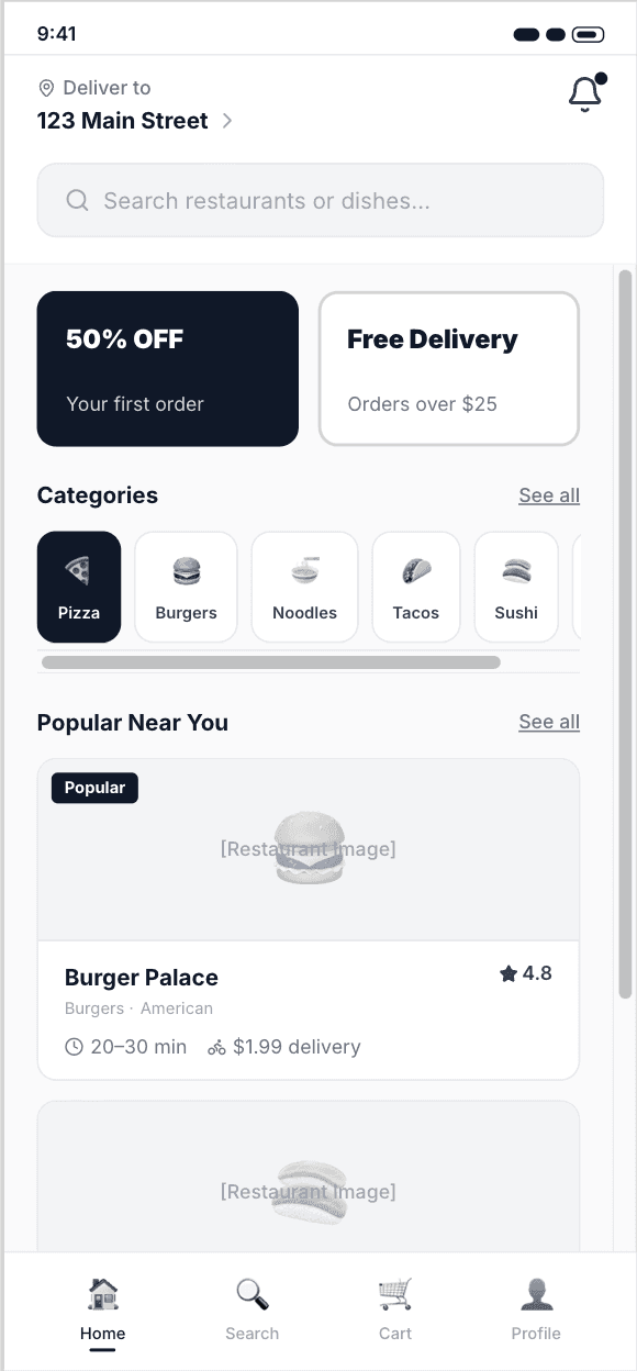

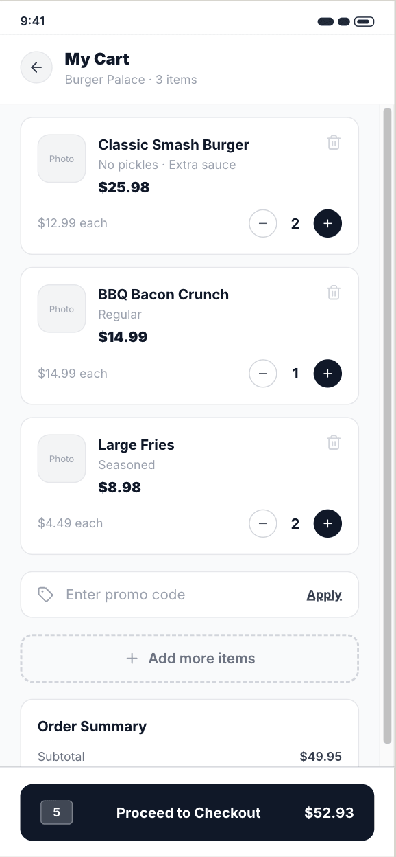
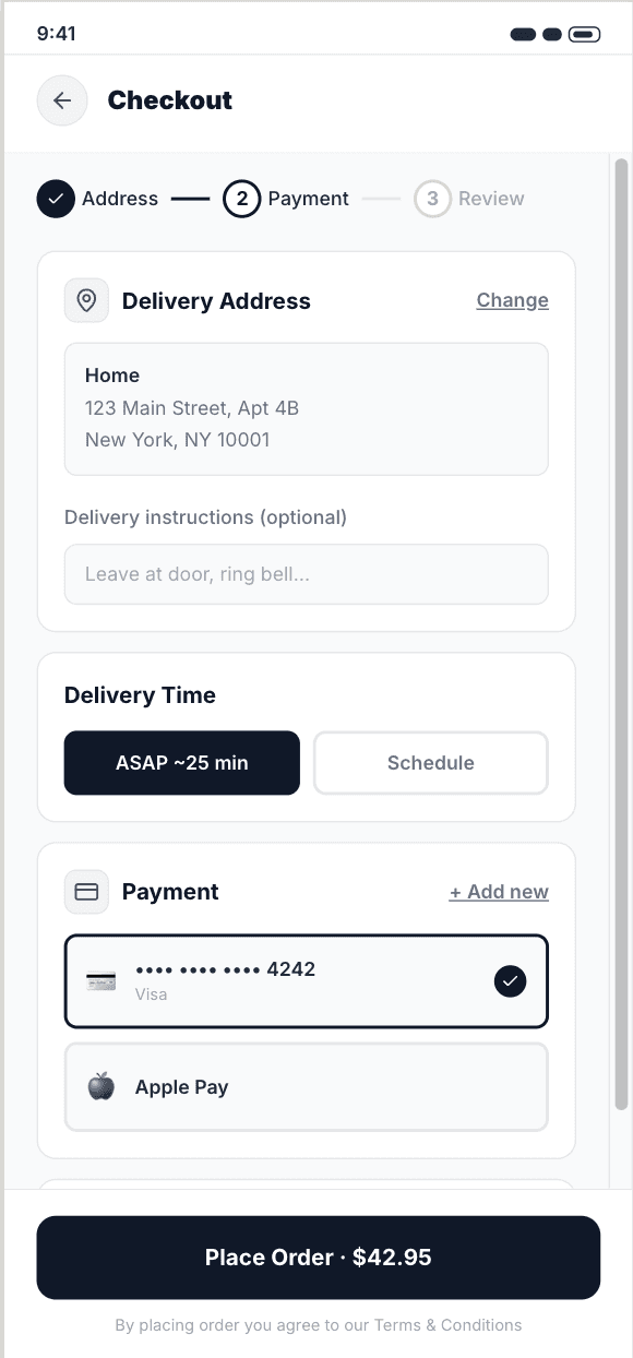
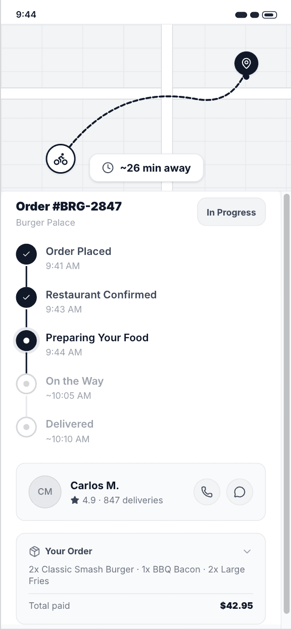
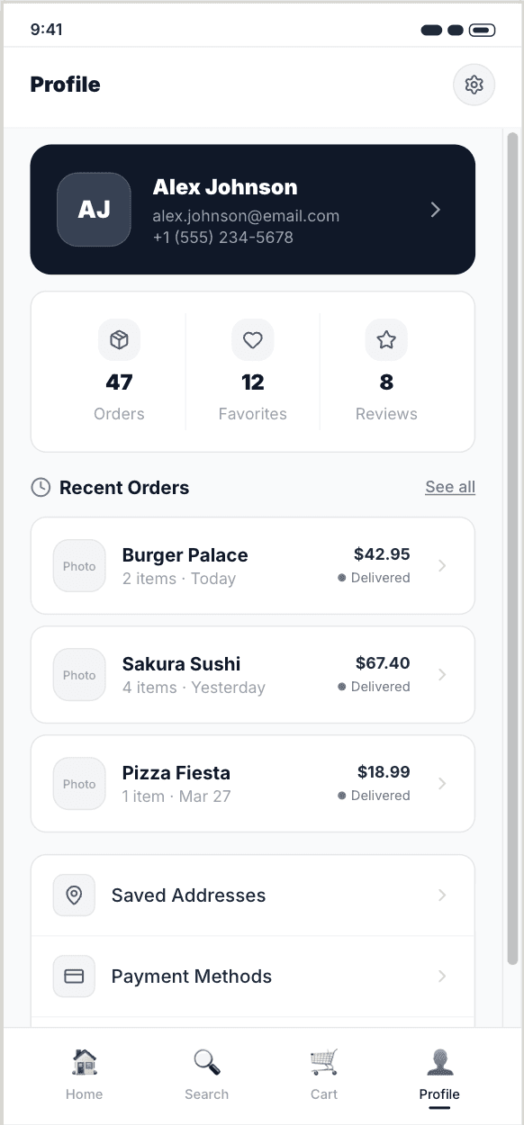
The final wireframes achieved an 88% task completion rate, compared to 51% on the original app.
3 Critical issues identified
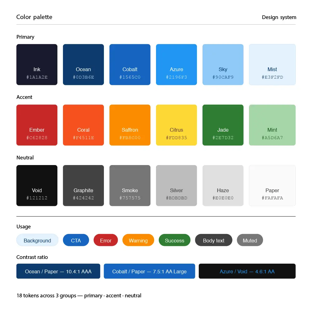
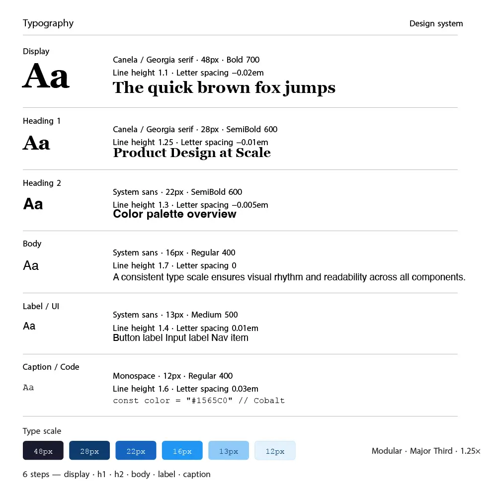
The visual direction needed to feel energetic and appetizing while remaining fast and functional. I developed a warm, high-contrast design system using a saffron and charcoal palette with rounded components to keep the tone friendly and approachable.
Prototyping & Testing
I built a high-fidelity prototype in Figma and ran 4 rounds of moderated and unmoderated testing with 28 participants using Useberry for remote sessions.
28 Test Participants 4 Testing Rounds 91% Task Success Rate
"Ordering feels so much faster now. I didn't have to think at all - it just guided me through."
Iterations & Refinements
Iteration 1: Collapsed the 4-step customization flow into a single bottom sheet. Result: 28% reduction in time-on-screen during item selection.
Iteration 2: Added a persistent "Reorder" shortcut on the home screen for returning users. Result: 40% increase in repeat order rate during beta testing.
Final Design
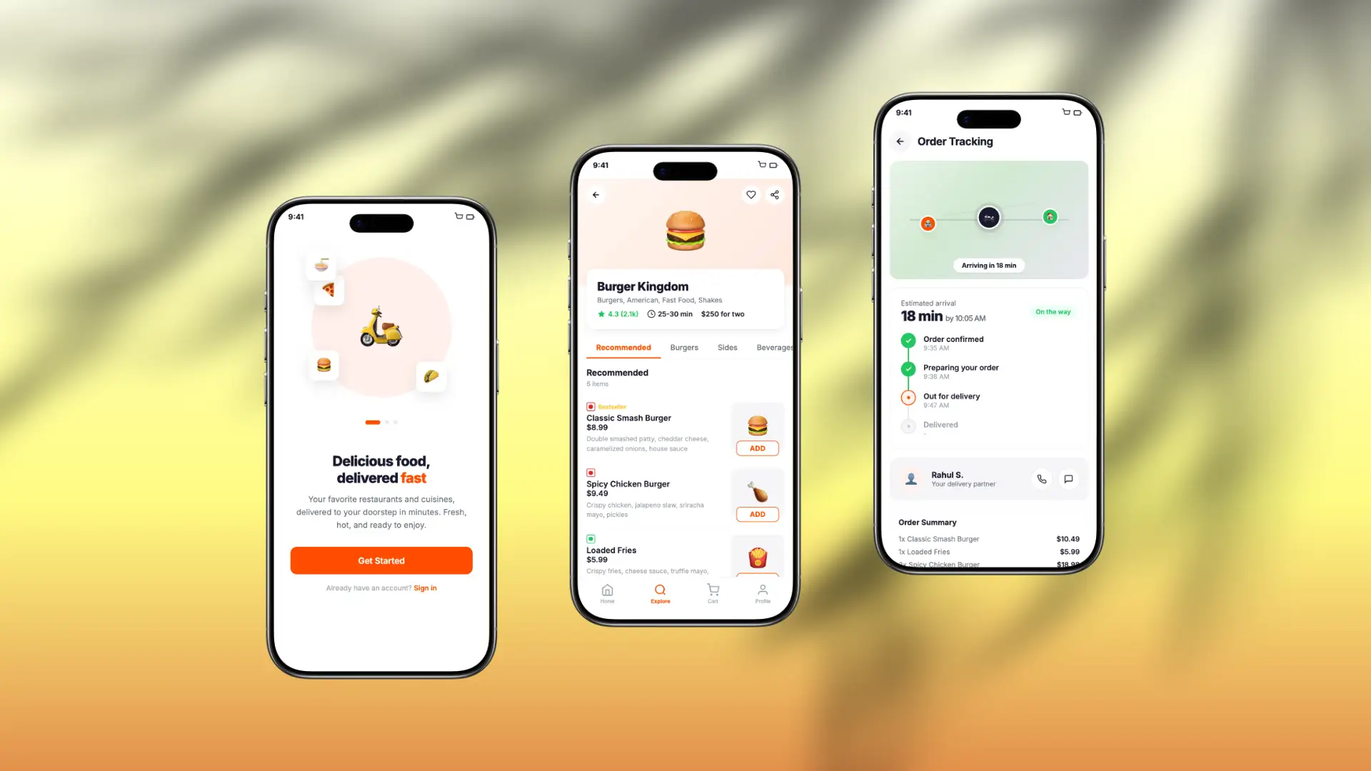
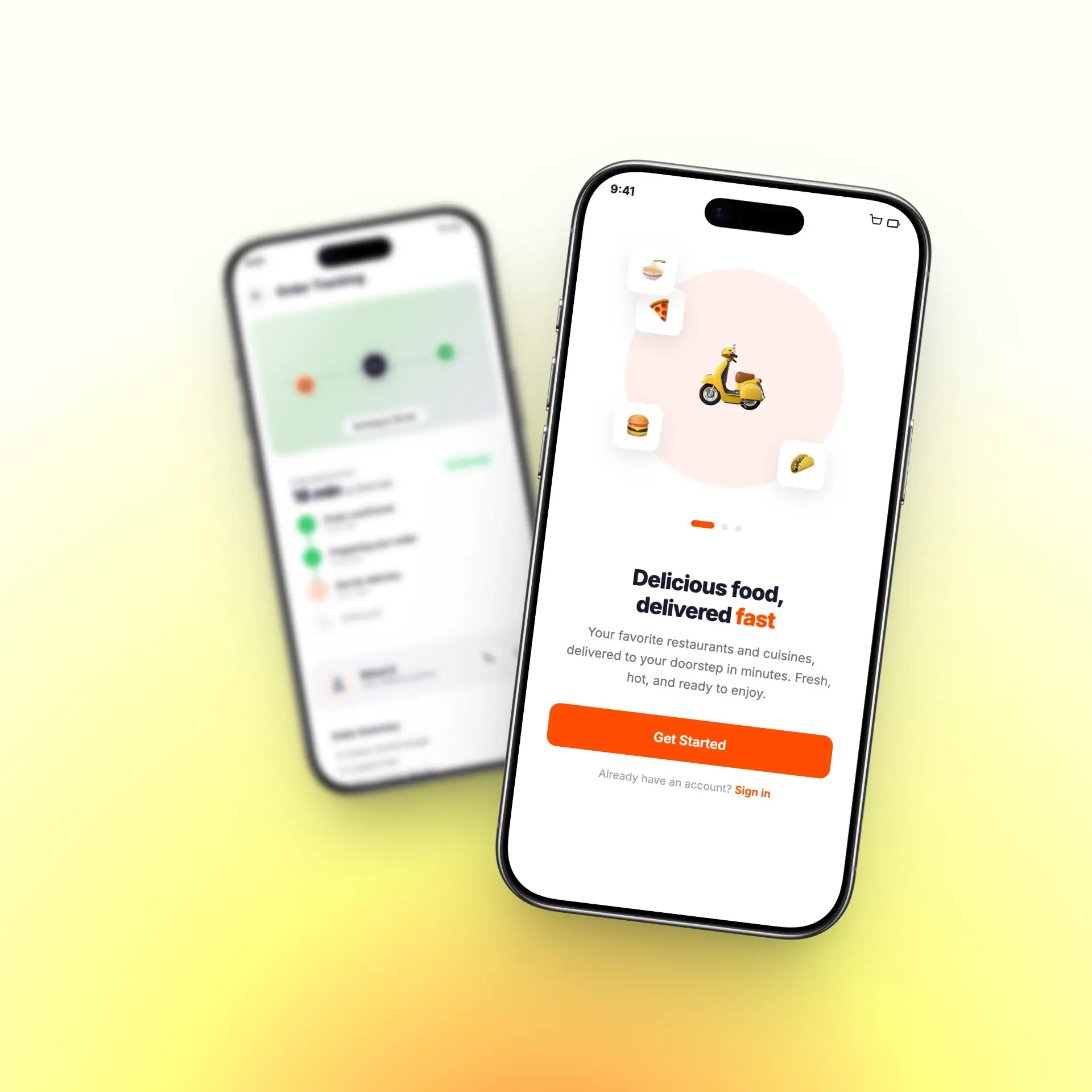
The final design, "QuickFlow," delivers a fast, frictionless ordering experience with a strong visual identity. Key features include:
One-tap reorder with saved preferences and last delivery address
Smart restaurant discovery with real-time wait time indicators
Single-screen item customization with inline add-ons
Live order tracking with animated map and delivery updates
Personalized home feed based on order history and time of day
Full accessibility compliance with WCAG AA contrast and touch target standards
Impact
54%
Reduction in cart abandonment
4.6
App Rating
40%
Increased Order
18
Medium
Lessons Learned
In food apps, speed and confidence matter more than visual richness
Reorder flows are underinvested in most delivery apps despite being the highest-frequency use case
Motion and micro-interactions significantly improve perceived performance
Testing with real restaurant menus (not dummy content) exposed critical edge cases early
Next Steps
Introduce AI-powered meal suggestions based on time of day and past orders
Build a group ordering feature for office and social use cases
Expand the design system into a shared component library with the engineering team
Run a 90-day retention study to measure long-term behavioral impact