PulseHR – Smart Workforce Management Platform
PulseHR is a 5-month end-to-end redesign of an enterprise HR management platform used by mid-sized and large organizations.
Role
Duration
Tools
Team
Project Overview
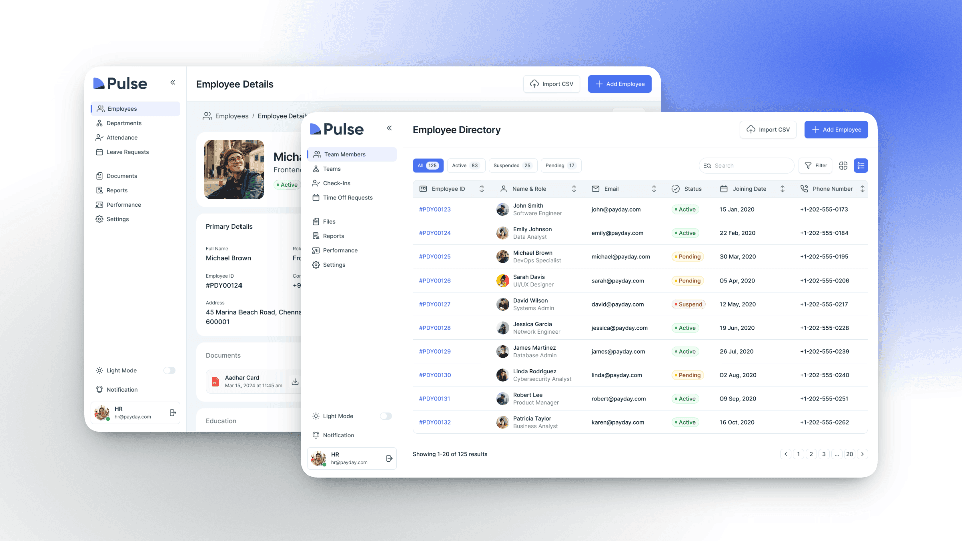
PulseHR is a B2B HR platform serving 800+ companies, helping HR teams manage hiring pipelines, employee performance, payroll, and team collaboration from a single dashboard. The platform had been built incrementally over 5 years, resulting in a fragmented experience with inconsistent UI patterns across modules.
I was brought in as Lead Product Designer to unify the entire platform experience, reduce operational friction for HR managers, and modernize the visual design system ahead of a major enterprise sales push.
800+
Companies Onboarded
120K +
Employees Managed
14
Platform Modules
18
Medium
Problem Statement
PulseHR's platform had a 48% feature abandonment rate, with users frequently switching to spreadsheets and third-party tools to complete tasks the platform was supposed to handle. The core issues were deeply nested navigation, inconsistent data presentation, and a hiring workflow that required 11 steps to move a single candidate through the pipeline.
68% of HR managers reported using external tools for tasks PulseHR should cover
The hiring pipeline had an average completion time of 14 minutes per candidate action
Onboarding new HR staff to the platform took an average of 3 weeks
The mobile experience was essentially unusable, with 0% of tasks completable end-to-end
Customer churn had increased from 8% to 19% over 18 months
My Role
As Senior Experience Designer, I audited customer friction across the Mobile + Home and Home Internet sales funnel, uncovering both experience gaps and systemic UI issues. I turned these findings into clear, centralized documentation and worked cross-functionally to get leadership aligned on the problems. This case study covers that audit and prioritization phase of top 3 critical issues; the resulting plan tile and purchase flow redesigns are detailed separately.
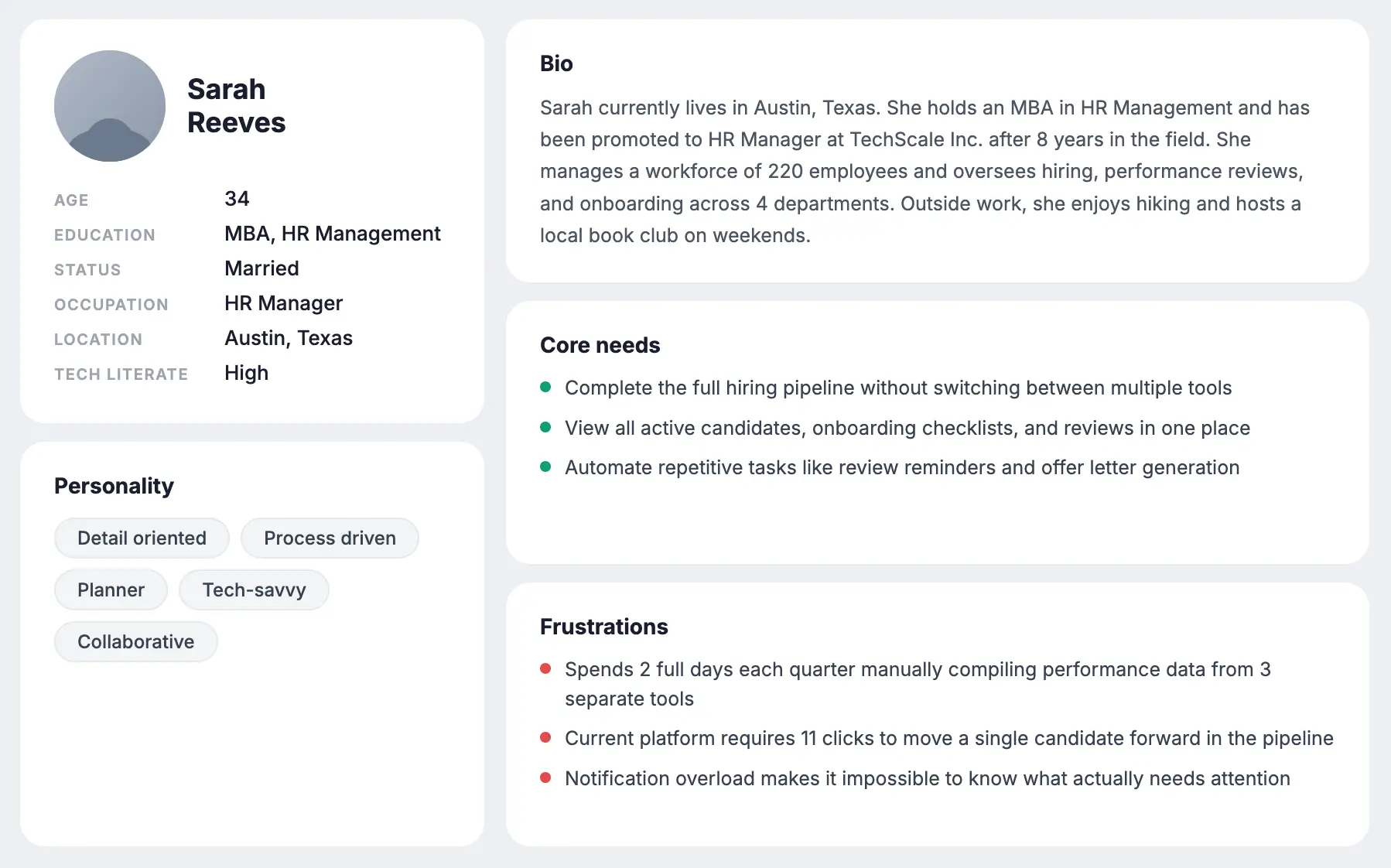
Research & Discovery
Key Findings
67.8% of customers dropped off directly on the plan tile page; before even reaching the cart, signaling the friction starts at plan selection itself, not just at checkout.
Nearly all customers who reach the joint mobile and FWA cart leave without completing the purchase.
About 1 in 4 mobile customers eventually add Fios, but only through separate nudges over time, since a joint cart option doesn't exist for Mobile and Fios yet.
Ideation
Quantifying Customer Friction
Centralizing issue records revealed recurring friction patterns across the journey, exposing systemic risks that a piecemeal view had been hiding.
Enhanced
Prioritization
With every finding in one place, we could rank issues by severity and frequency, and put resources against the pain points that actually mattered most.
Informed Strategic Trade-offs
Centralized records made the "cost of inaction" visible, giving leadership clear evidence for what's at stake whenever new features get prioritized over fixing broken experiences.
User Flow
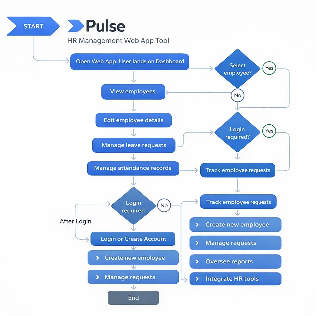
I mapped 5 primary user journeys across 3 user roles: HR Manager, Team Lead, and Employee. The priority flow was the end-to-end hiring pipeline, which we targeted to reduce from 11 steps to 4.
Job posting to candidate pipeline - one-screen job builder with smart templates and auto-publishing to job boards
Candidate review to offer - unified candidate card with inline interview scheduling, feedback collection, and offer generation
Employee onboarding - automated onboarding checklist assigned by role, with progress tracking for both HR and the new hire
Performance review cycle - templated review forms with auto-reminders, peer nomination, and manager sign-off in one workflow
Wireframing
I created wireframes for 34 key screens across all platform modules, starting with low-fidelity sketches and moving to mid-fidelity component-based layouts across 4 iteration rounds. Every round included structured review sessions with 3 customer HR teams.
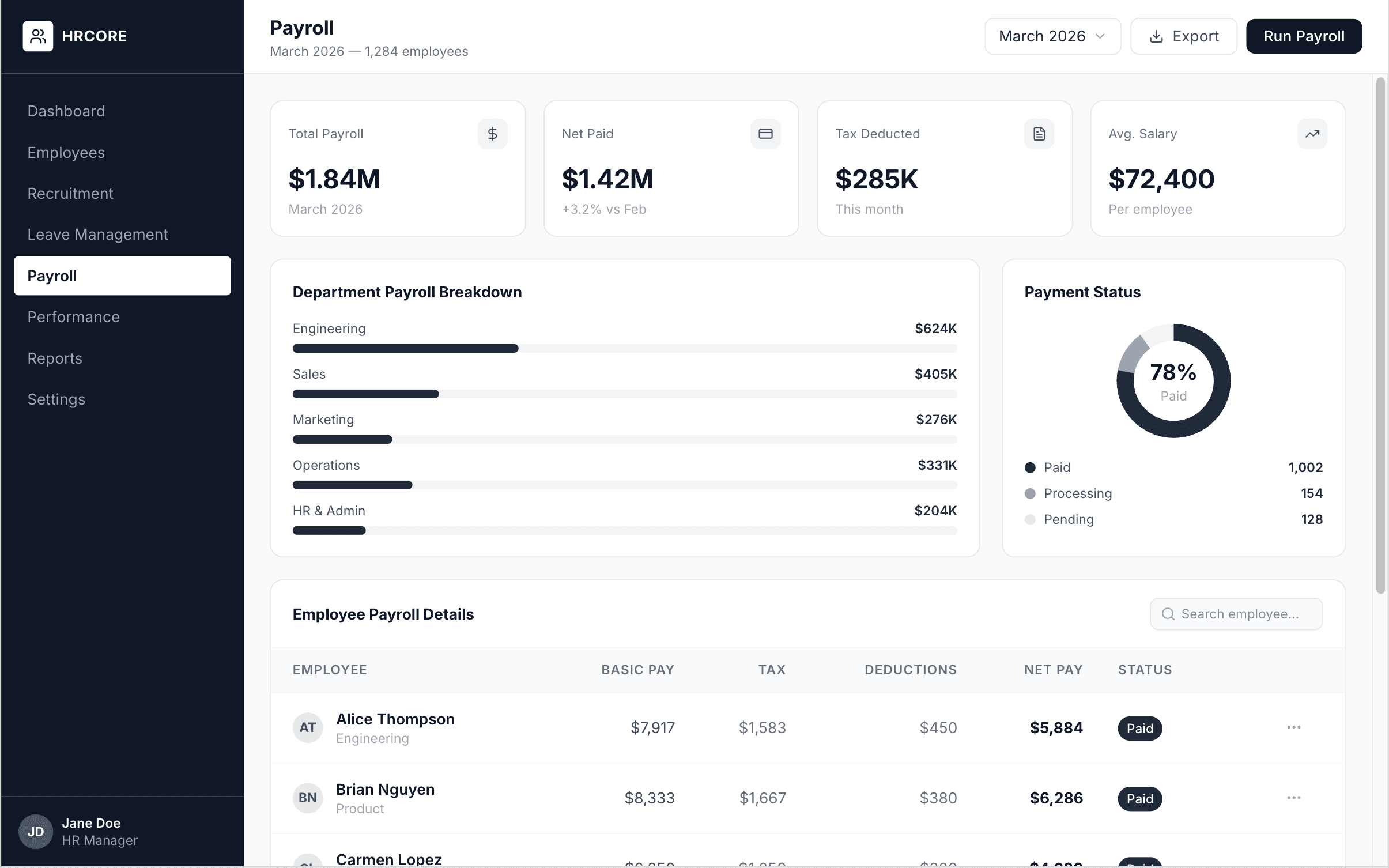
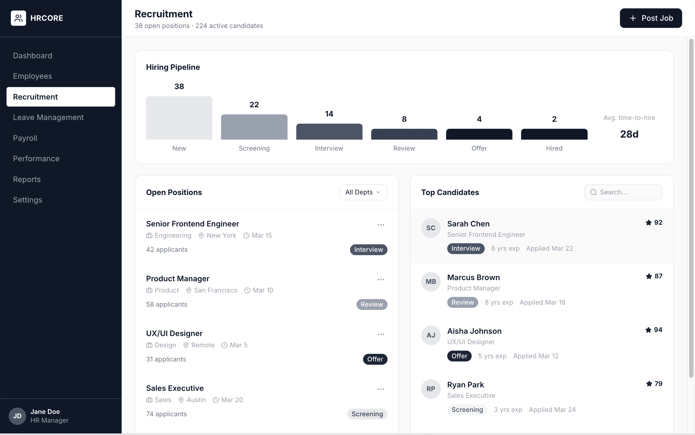
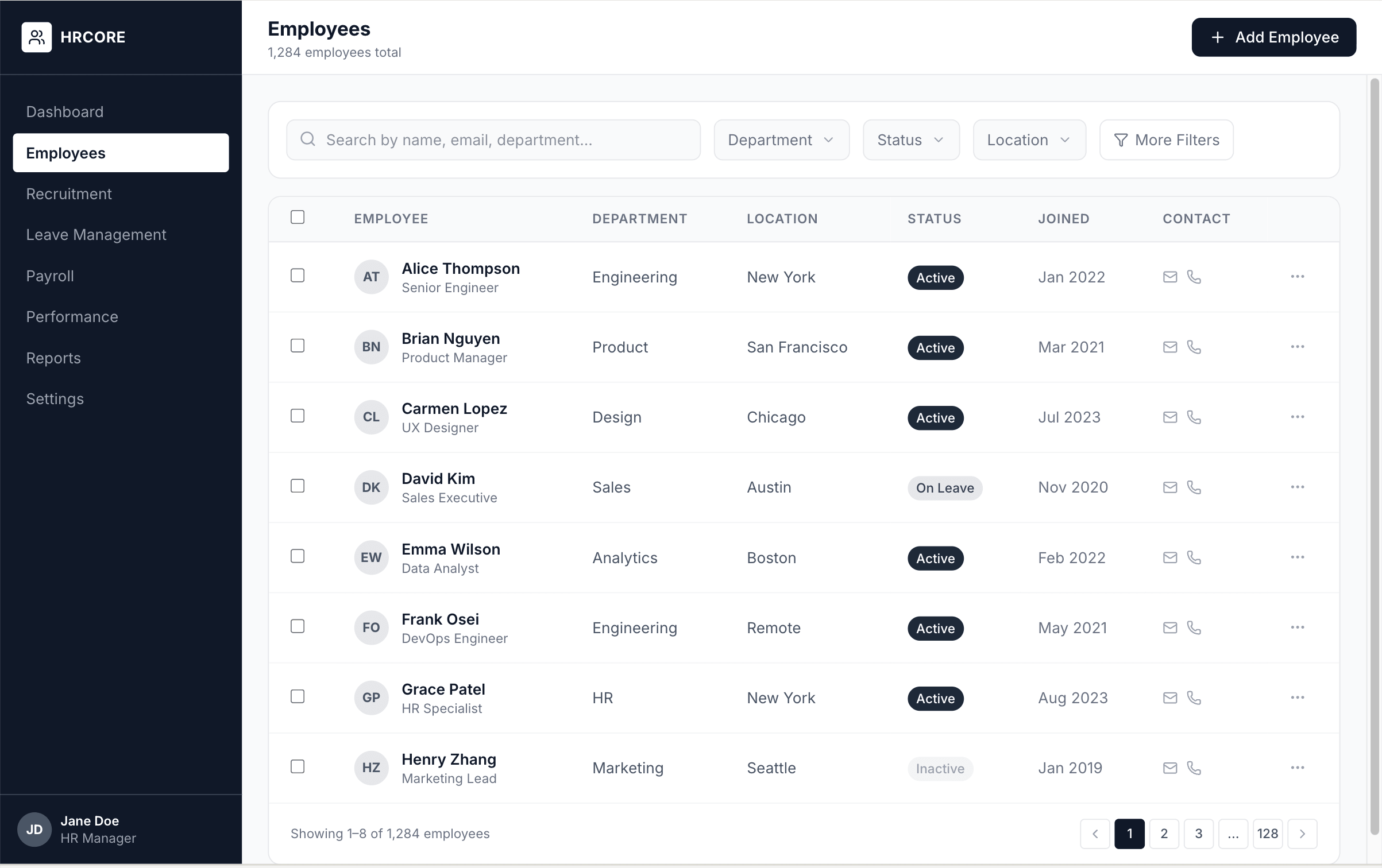
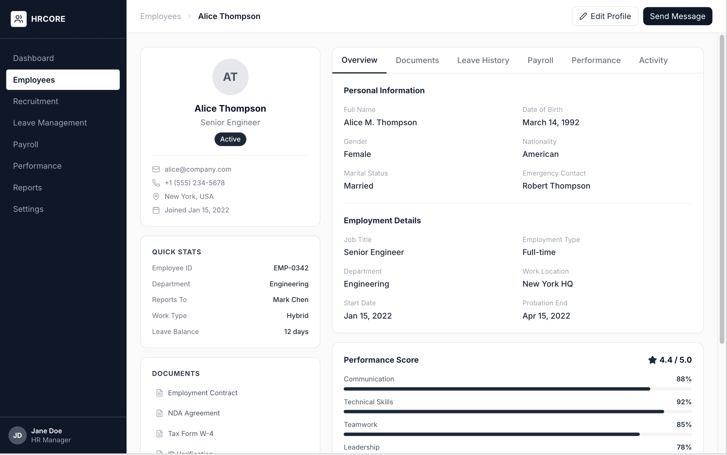
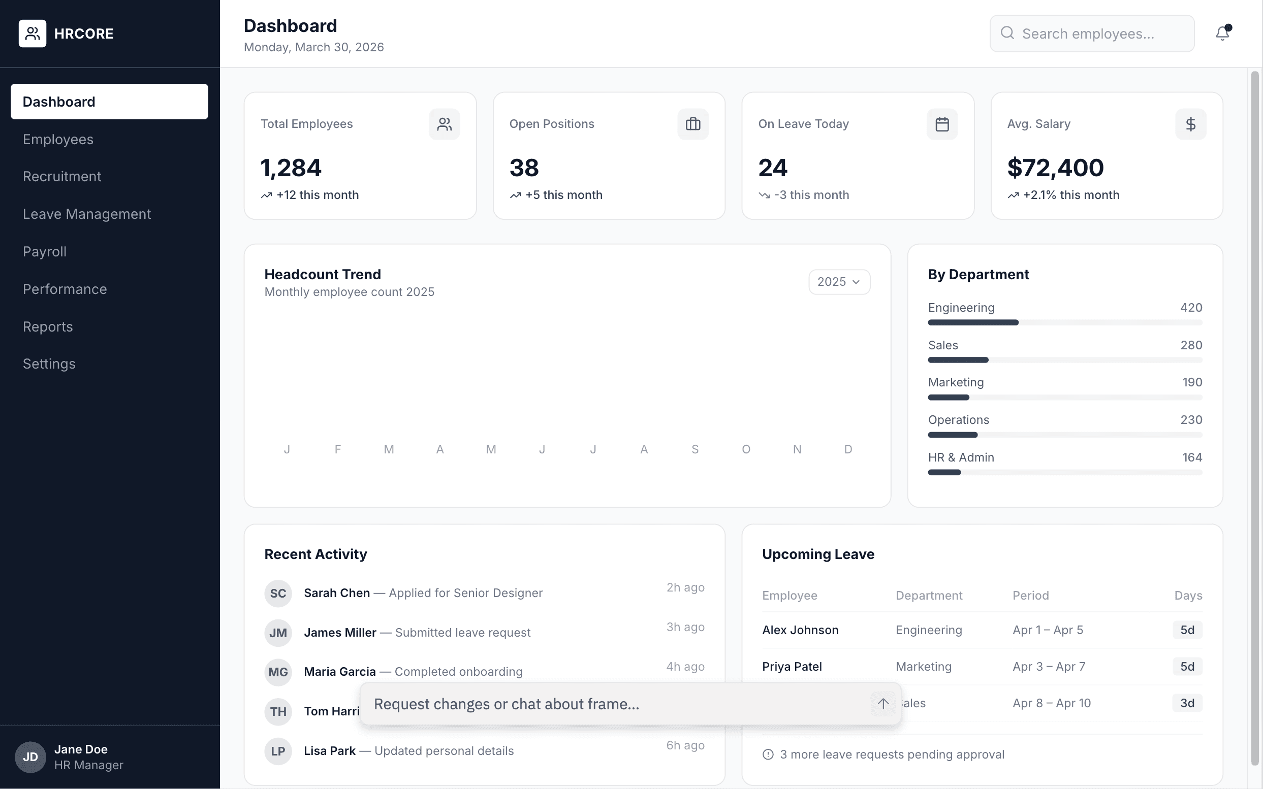
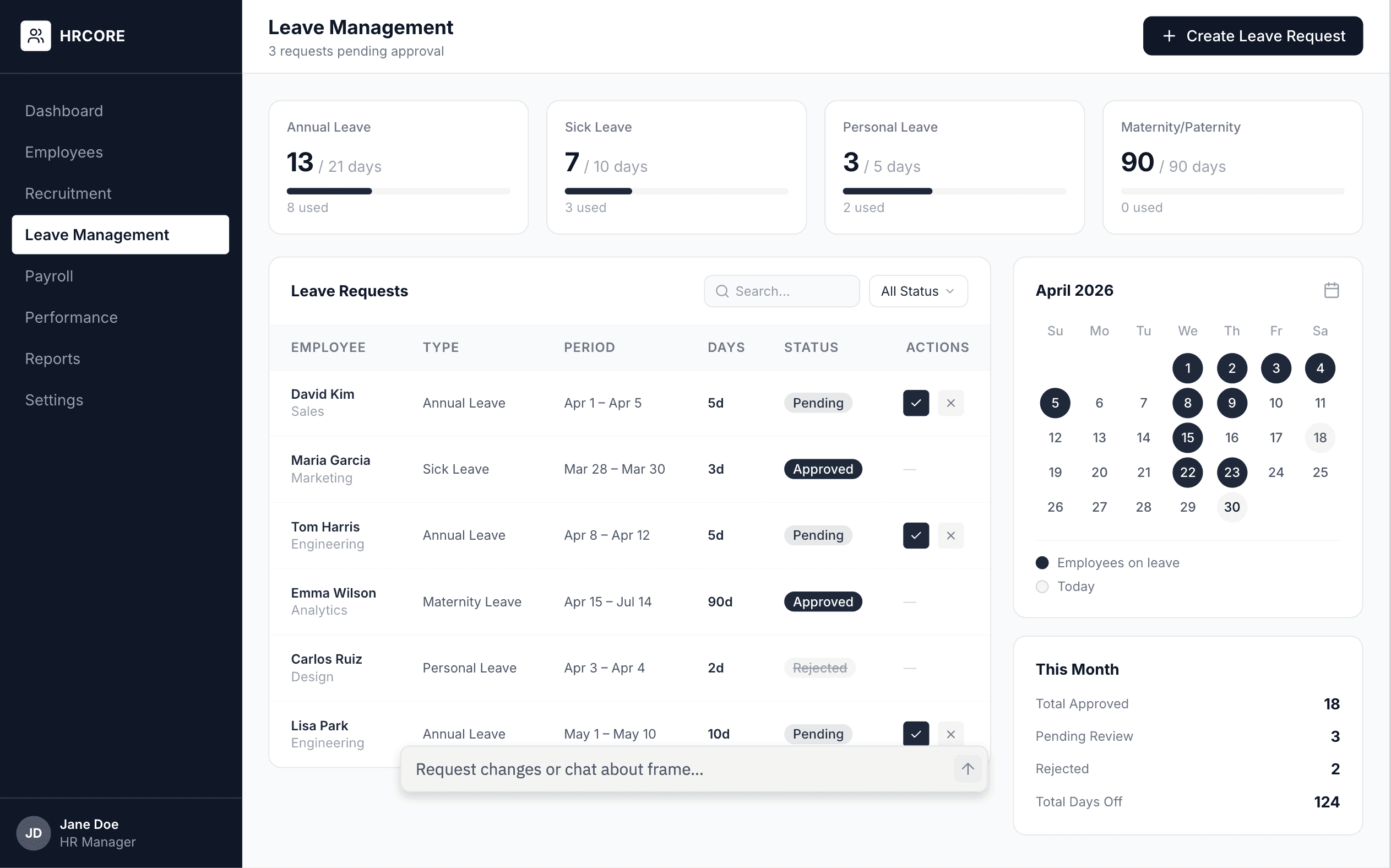
The final wireframes achieved a 91% task completion rate in structured walkthroughs, compared to 44% on the original platform.
Visual Design
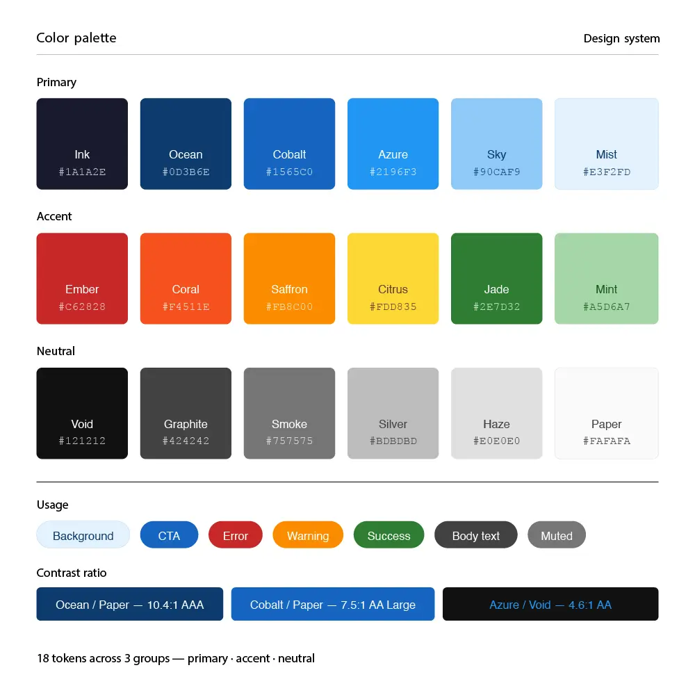
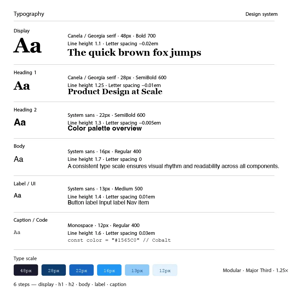
The visual direction needed to communicate trust, clarity, and professionalism without feeling cold or bureaucratic. I built a design system anchored in a deep navy and warm white palette, with a secondary teal accent for positive states and actions. The typography system uses a structured hierarchy with generous spacing to handle dense data tables without feeling overwhelming.
Prototyping & Testing
I built a high-fidelity interactive prototype in Figma covering all 5 primary user flows and ran 5 rounds of moderated usability testing with 32 participants across HR manager, team lead, and employee roles using Maze for unmoderated benchmark testing.
This is the first time I've used HR software that didn't make me feel like I needed a manual.
Heatmap Analysis
Iteration 1: Collapsed the 3-panel candidate review screen into a single unified candidate card with expandable sections. Result: 46% reduction in time-to-action per candidate, confirmed in Maze benchmark testing.
Iteration 2: Replaced the legacy sidebar navigation with a contextual command bar and role-filtered dashboard. Result: New user onboarding time dropped from 3 weeks to 4 days in beta testing with 3 enterprise clients.
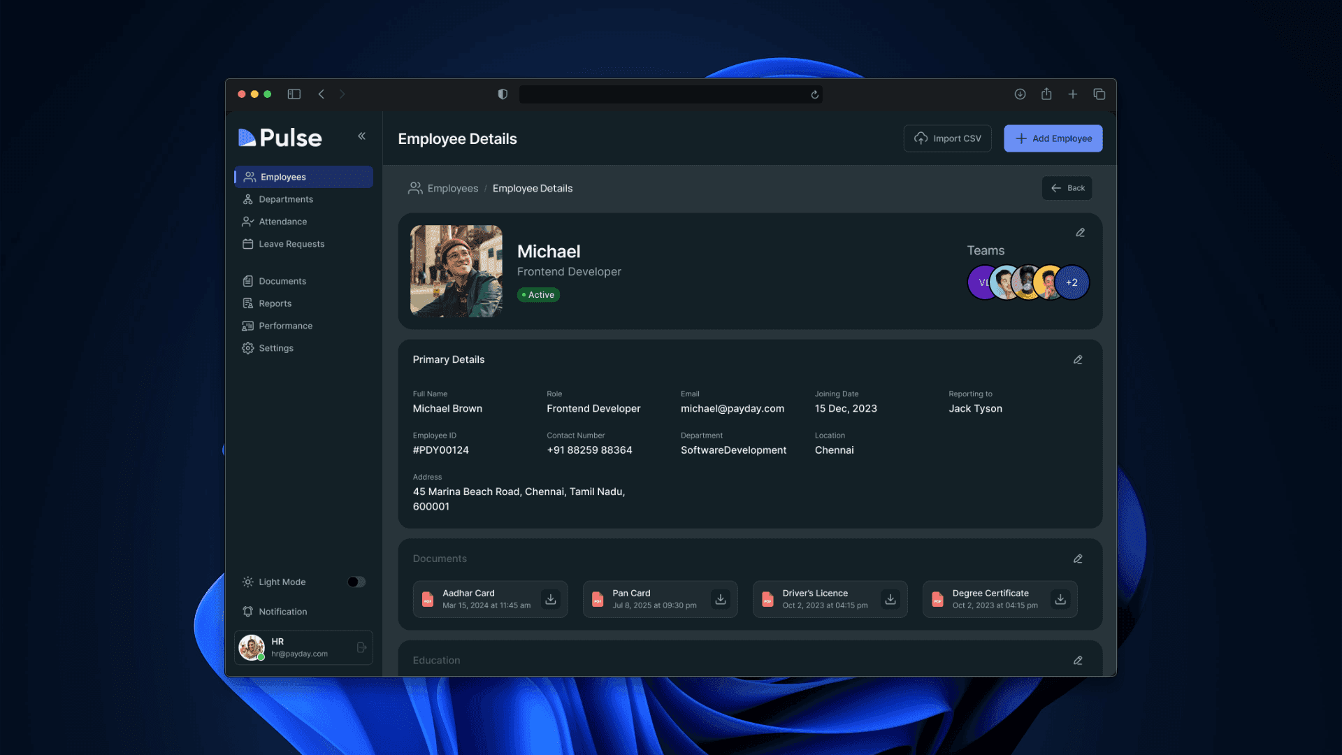
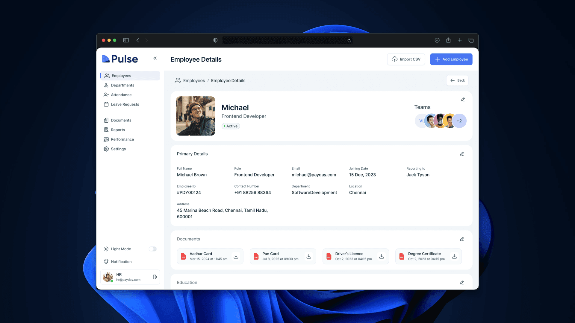
Final Design
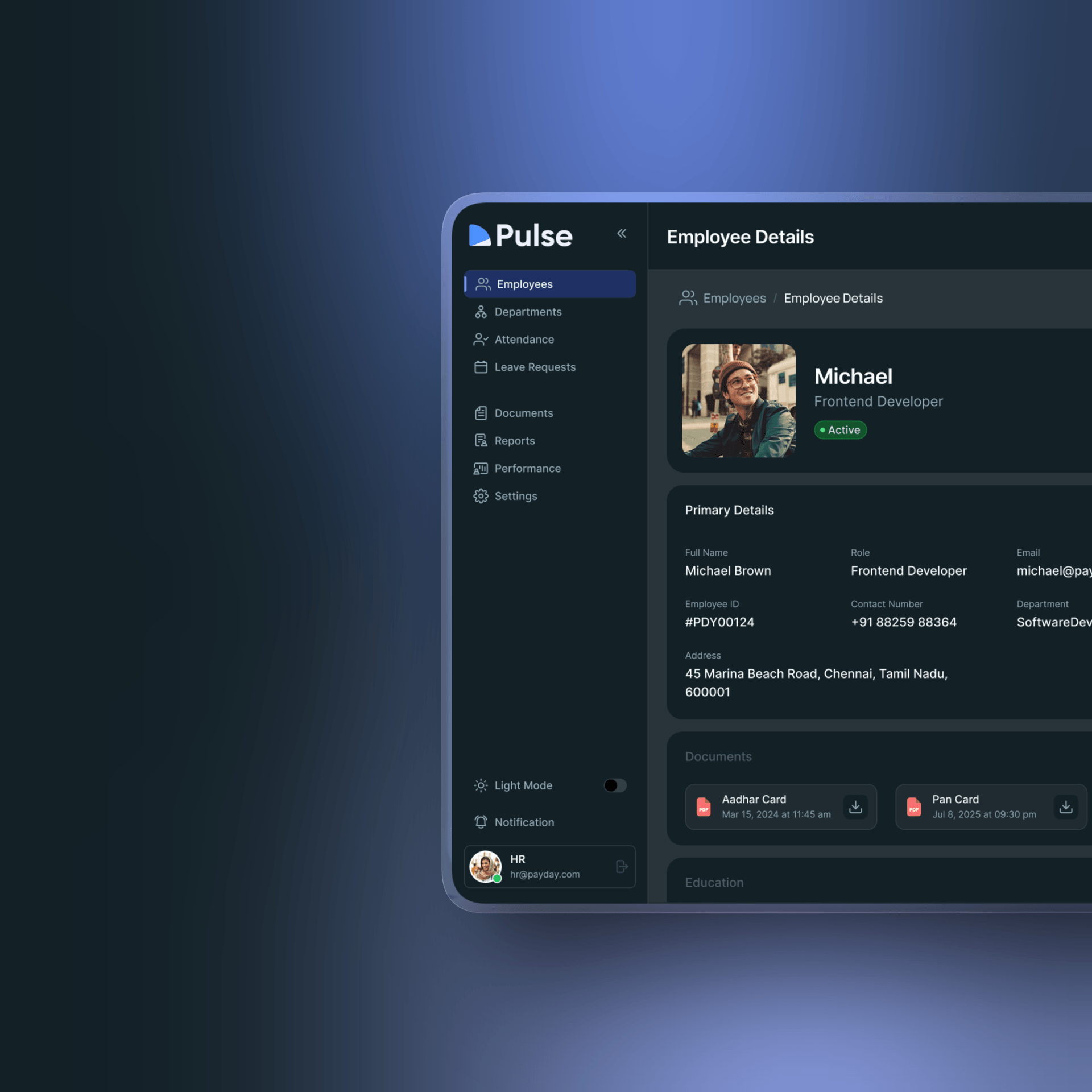
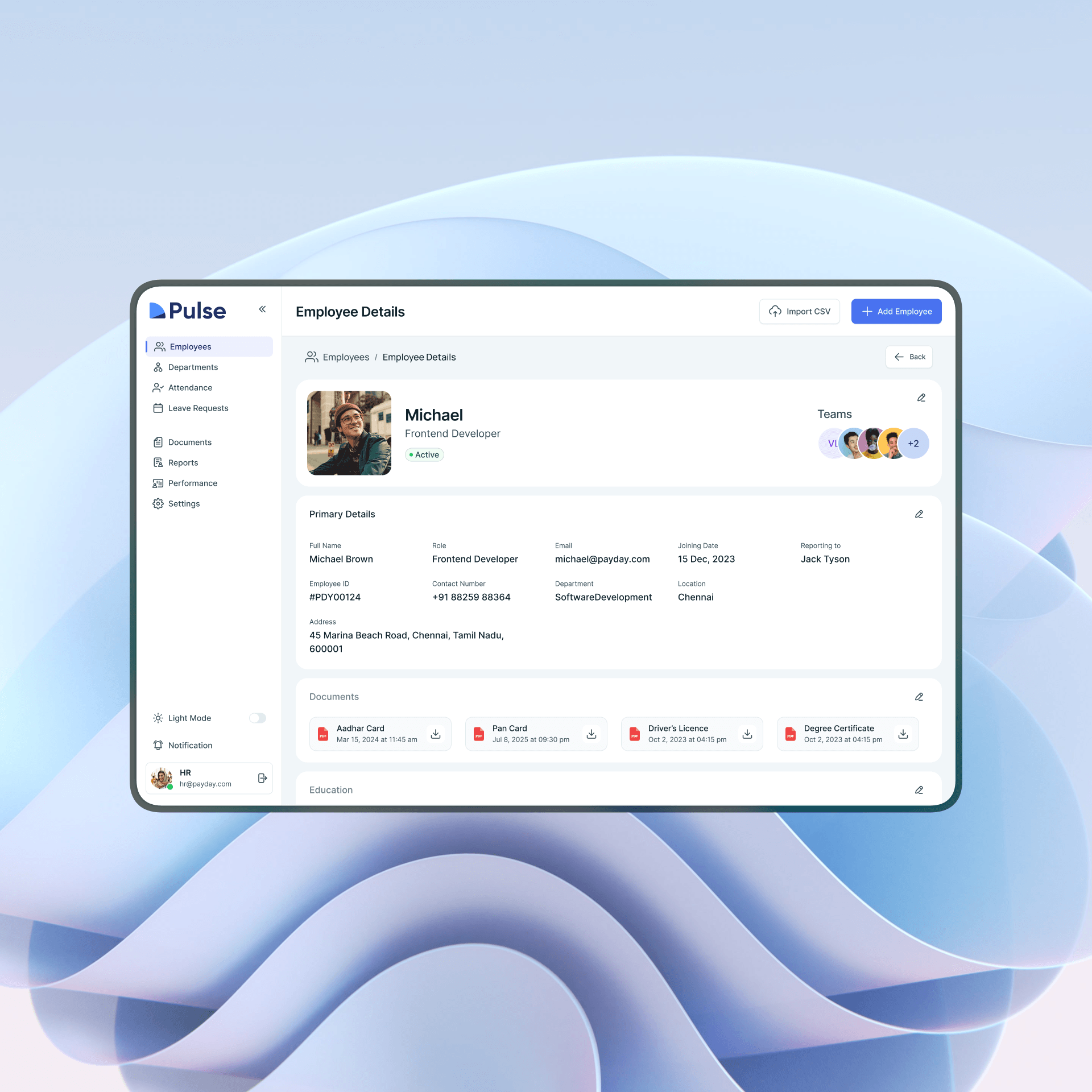
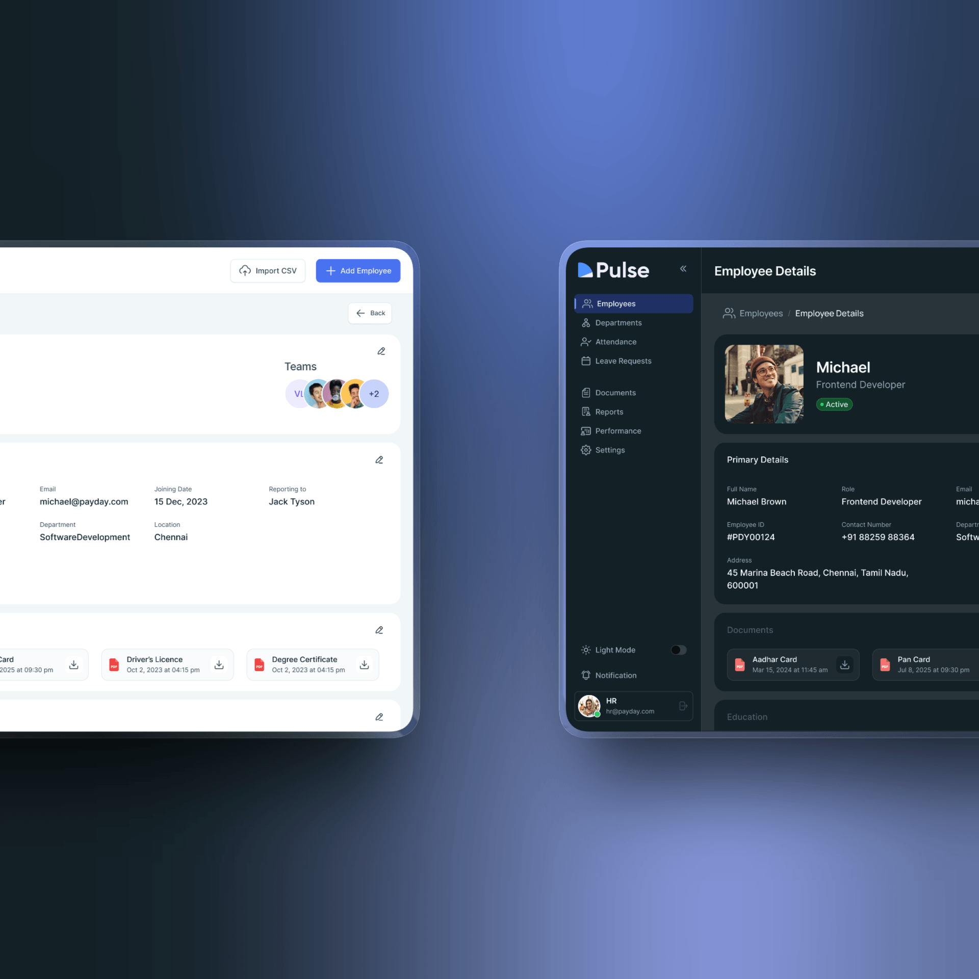
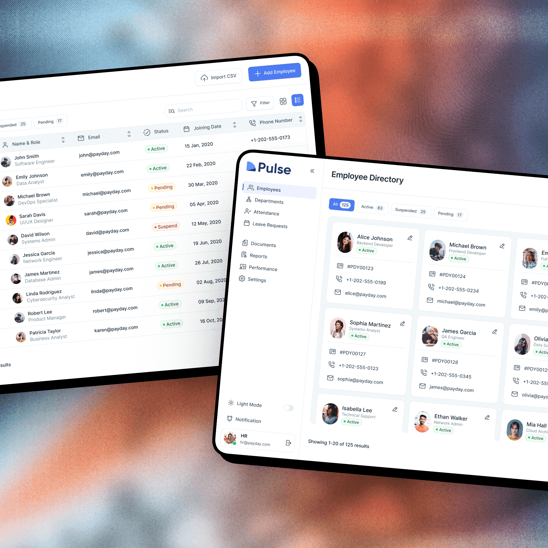
The final design, "ClearDesk," delivers a unified, role-aware HR management experience that scales from 50-person startups to 10,000-person enterprises. Key features include:
Role-aware dashboard with personalized task queues and smart notifications
4-step hiring pipeline with inline candidate scoring and one-click offer generation
Automated onboarding workflows with real-time completion tracking
Bulk employee management with advanced filtering and CSV export
Performance review engine with configurable templates and automated reminders
Real-time workforce analytics with exportable custom reports
Responsive design with full feature parity on tablet and mobile
Impact
61% Reduction in feature abandonment 4 days New HR staff onboarding time (down from 3 weeks) 19% to 6% Customer churn improvement
Lessons Learned
Enterprise HR users are highly process-driven - any redesign must map to their existing mental models before introducing new patterns
Role-based information architecture is not optional at enterprise scale - showing everything to everyone destroys usability
Data-heavy interfaces need breathing room more than they need more features
Involving real customers as co-designers in sprints dramatically shortens validation cycles
Performance review features are emotionally sensitive - tone and microcopy matter as much as functionality
Next Steps
Build an AI-powered candidate screening layer with bias detection flagging
Introduce natural language search across all employee and candidate records
Expand the analytics module with predictive attrition risk scoring
Conduct a longitudinal study measuring 12-month retention and HR team productivity impact
Develop a public API for integration with payroll and benefits platforms