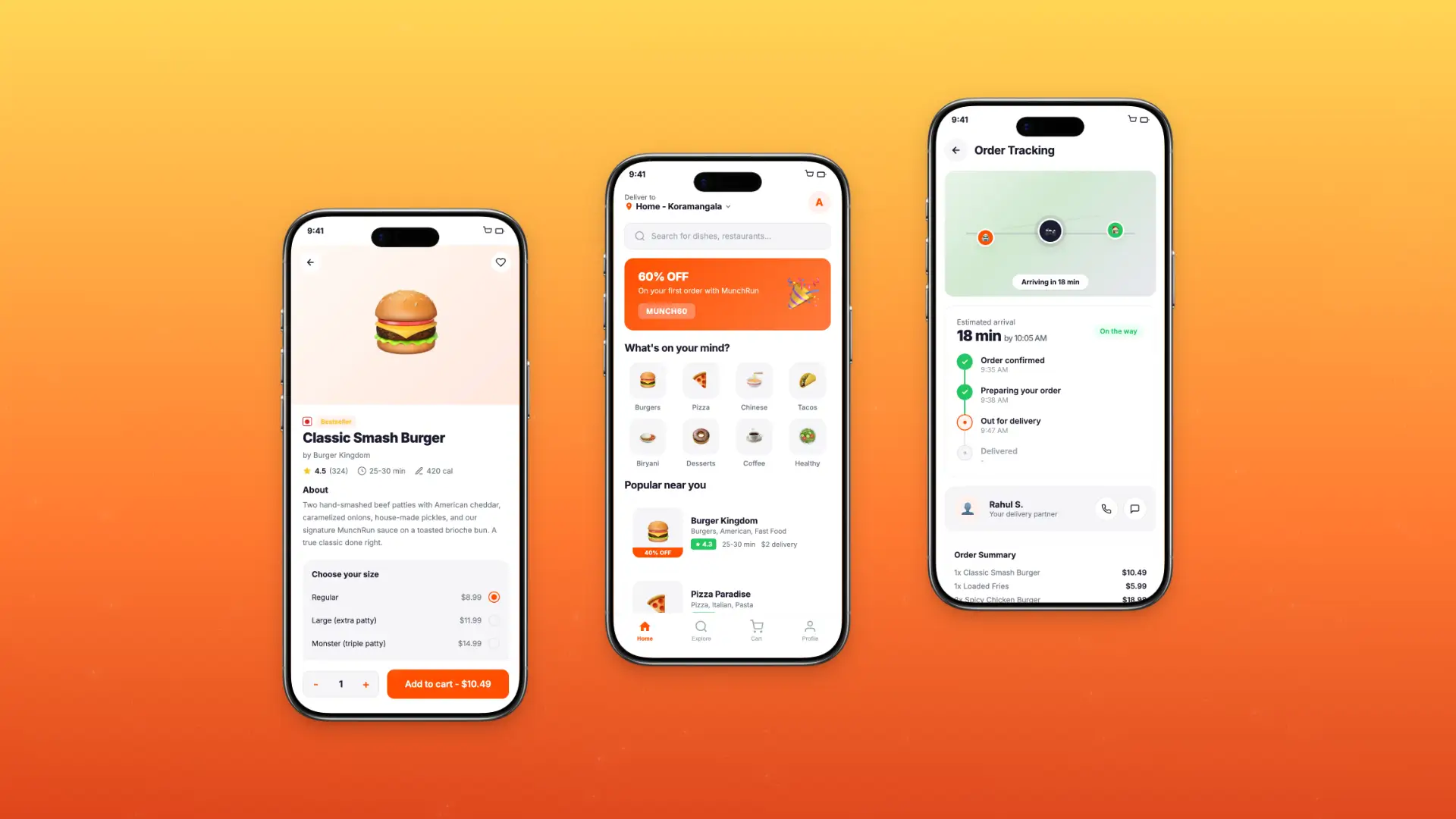
Roamly – Travel Planning & Booking App Redesign
Roamly is a 4-month end-to-end redesign of a travel planning and booking mobile app used by independent and group travelers across 18 countries.
Role
Duration
Tools
Team
Project Overview
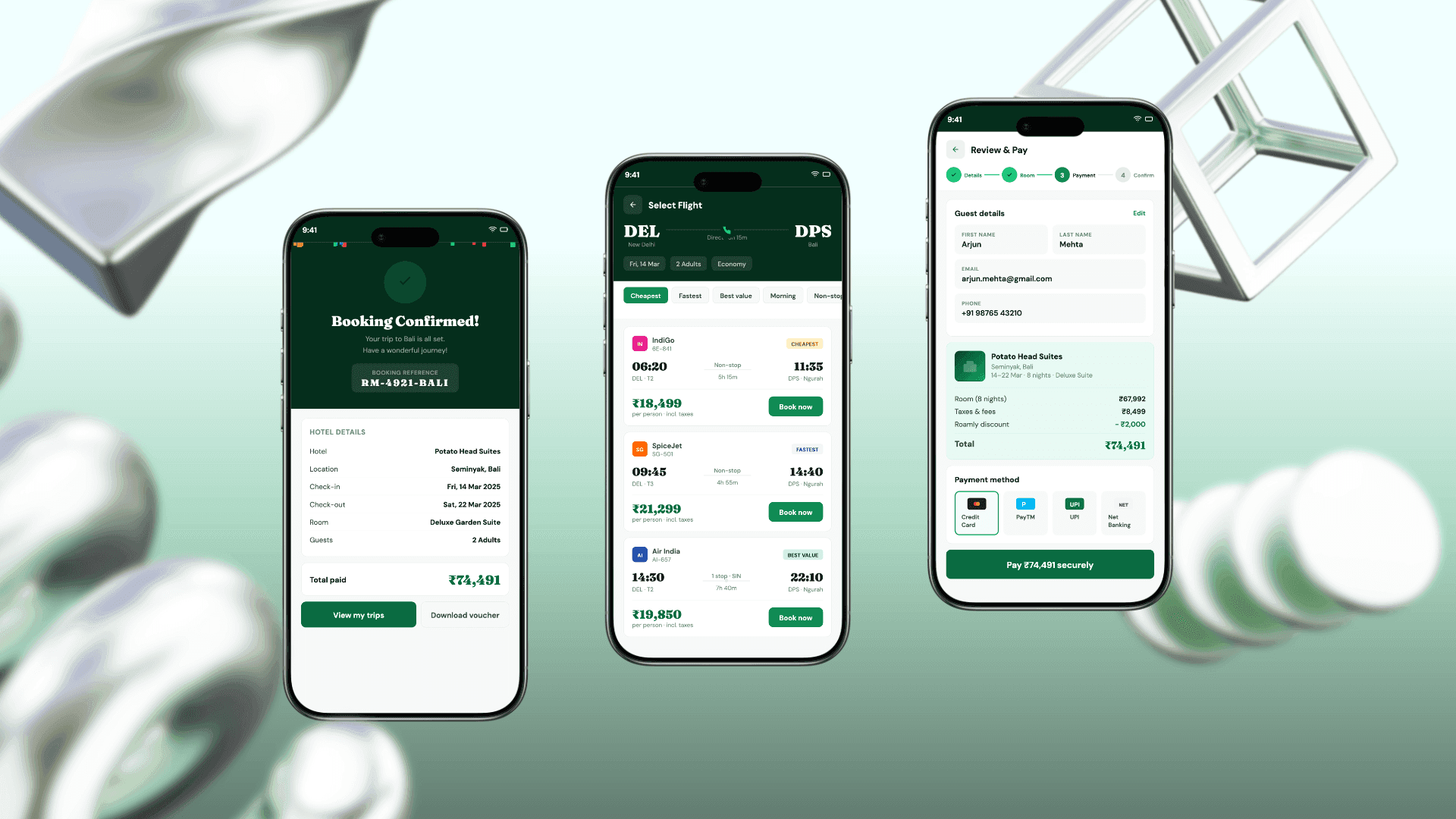
Roamly is a travel app serving 300,000+ active users across 18 countries, helping travelers discover destinations, plan itineraries, and book flights, hotels, and experiences in one place. The app had been built feature-by-feature over 4 years without a unified design vision, resulting in a fragmented booking experience that was losing users to leaner competitors.
I joined as Lead Product Designer to redesign the end-to-end travel planning experience, from destination discovery through to post-booking trip management, with a focus on reducing decision fatigue and increasing booking completion rates.
300K+
Active Users
18
Countries
12
Cities Served
18
Medium
Problem Statement
Roamly's app had a 61% booking abandonment rate, with users dropping off primarily during the search and comparison phase. The core problem was information overload - too many options, too little personalization, and a checkout flow that required users to re-enter details they had already provided at sign-up.
74% of drop-offs occurred during the hotel and flight comparison screens
Users spent an average of 11 minutes browsing before abandoning without booking
The itinerary builder was discovered by only 18% of users despite being a flagship feature
Group booking required each traveler to create separate accounts and merge manually
App Store rating had dropped from 4.4 to 3.6 over 12 months
My Role
As Senior Experience Designer, I audited customer friction across the Mobile + Home and Home Internet sales funnel, uncovering both experience gaps and systemic UI issues. I turned these findings into clear, centralized documentation and worked cross-functionally to get leadership aligned on the problems. This case study covers that audit and prioritization phase of top 3 critical issues; the resulting plan tile and purchase flow redesigns are detailed separately.
Research & Discovery
Key Findings
67.8% of customers dropped off directly on the plan tile page; before even reaching the cart, signaling the friction starts at plan selection itself, not just at checkout.
Nearly all customers who reach the joint mobile and FWA cart leave without completing the purchase.
About 1 in 4 mobile customers eventually add Fios, but only through separate nudges over time, since a joint cart option doesn't exist for Mobile and Fios yet.
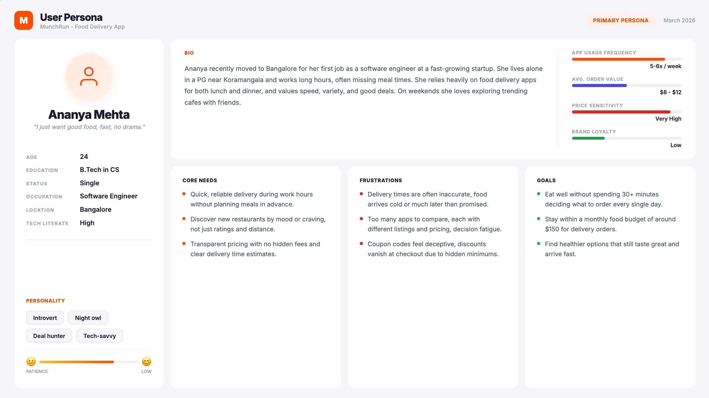
Ideation
Quantifying Customer Friction
Centralizing issue records revealed recurring friction patterns across the journey, exposing systemic risks that a piecemeal view had been hiding.
Enhanced
Prioritization
With every finding in one place, we could rank issues by severity and frequency, and put resources against the pain points that actually mattered most.
Informed Strategic Trade-offs
Centralized records made the "cost of inaction" visible, giving leadership clear evidence for what's at stake whenever new features get prioritized over fixing broken experiences.
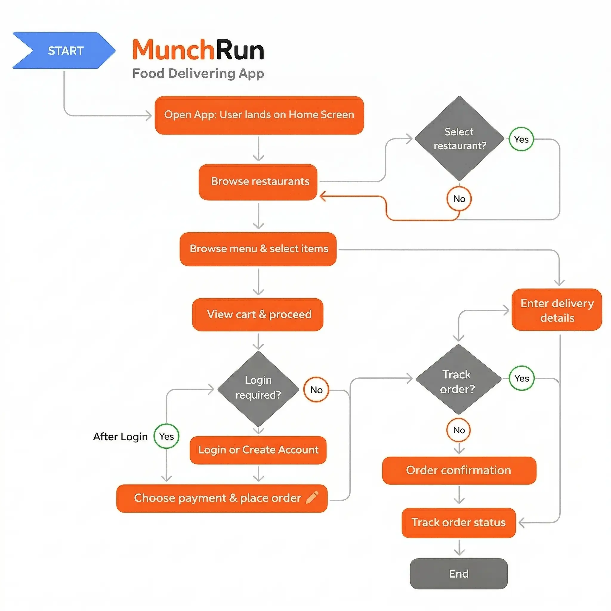
User Flow
I mapped 4 primary journeys across 2 user types: solo traveler and group organizer. The priority flow was the end-to-end booking journey, targeted to reduce from 9 steps to 3.
Destination discovery to trip board - personalized feed with travel style filters, save-to-trip functionality, and shareable trip links for group input
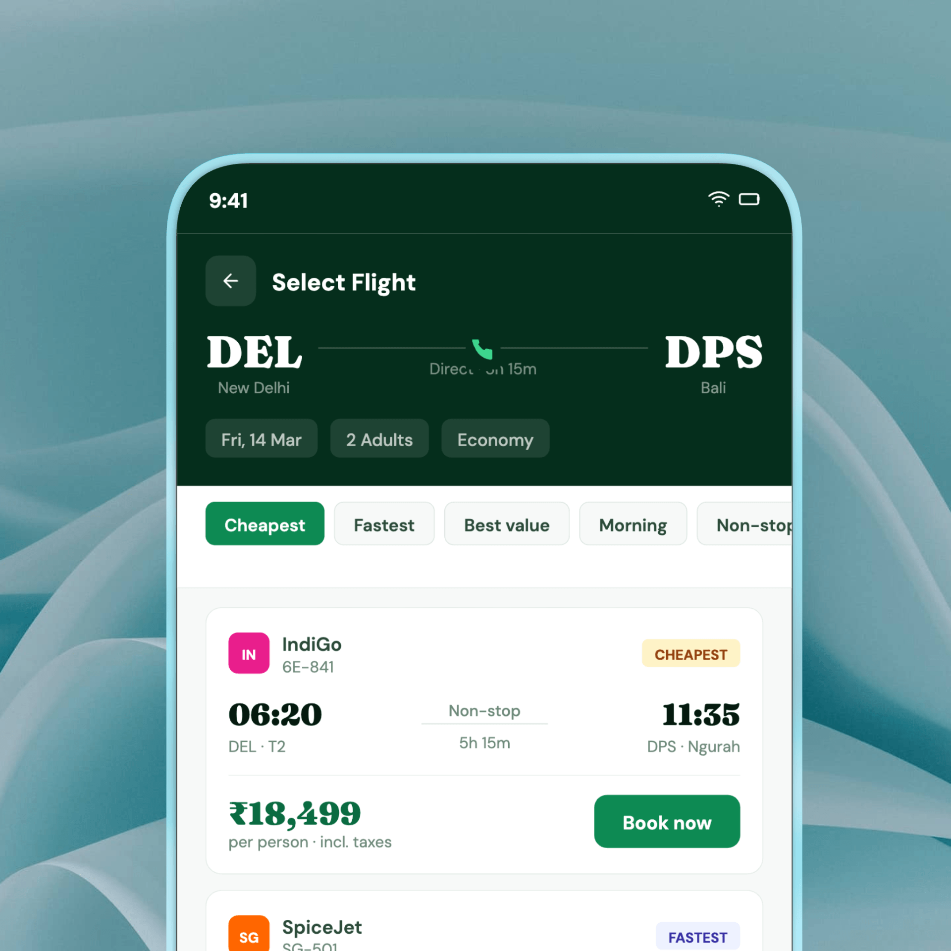
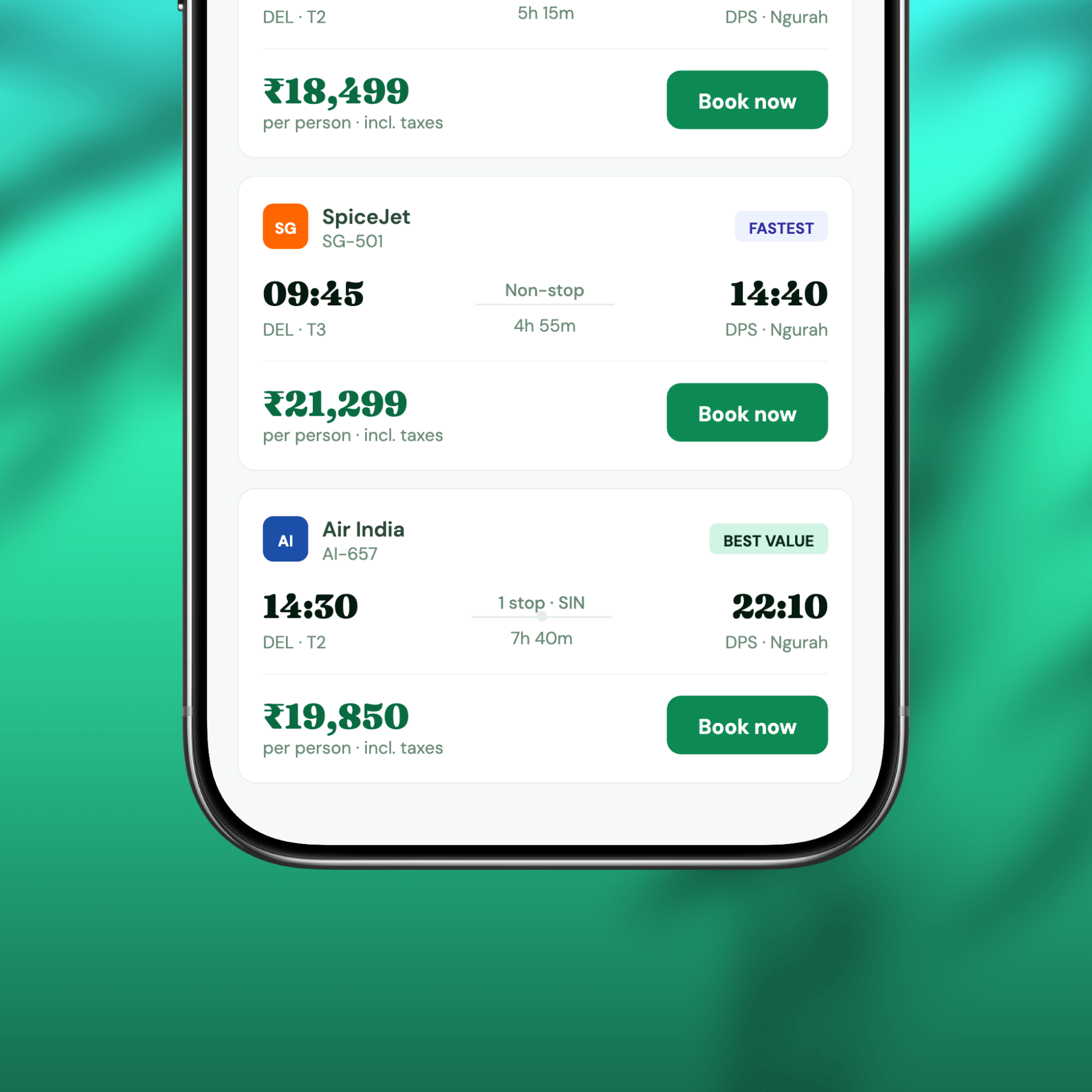
Search to booking - smart filters surfacing the top 5 options based on user preferences, with a one-screen comparison view and pre-filled checkout using saved traveler profiles
Group planning - shared trip board where all members vote on options, split cost estimates, and confirm bookings simultaneously
Post-booking trip hub - single screen showing all confirmed bookings, packing checklist, real-time flight updates, and local tips for the destination
Wireframing
I designed wireframes for 28 key screens across all 4 user flows, moving from rough sketches to mid-fidelity component-based layouts across 3 iteration rounds. Each round included structured walkthroughs with 5 travel user participants recruited via Lyssna.
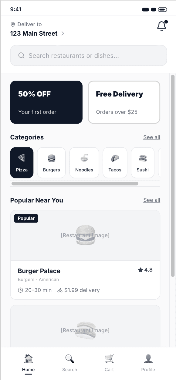

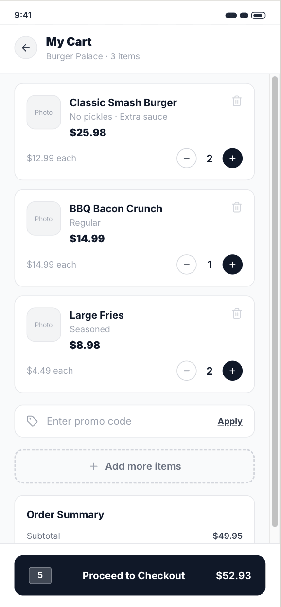
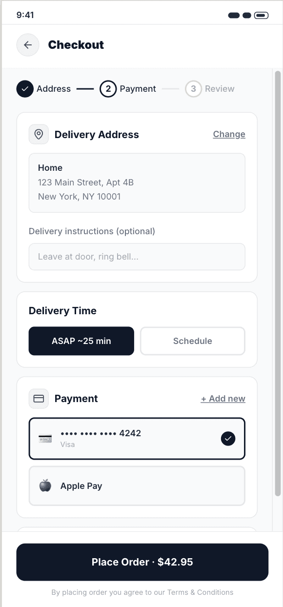
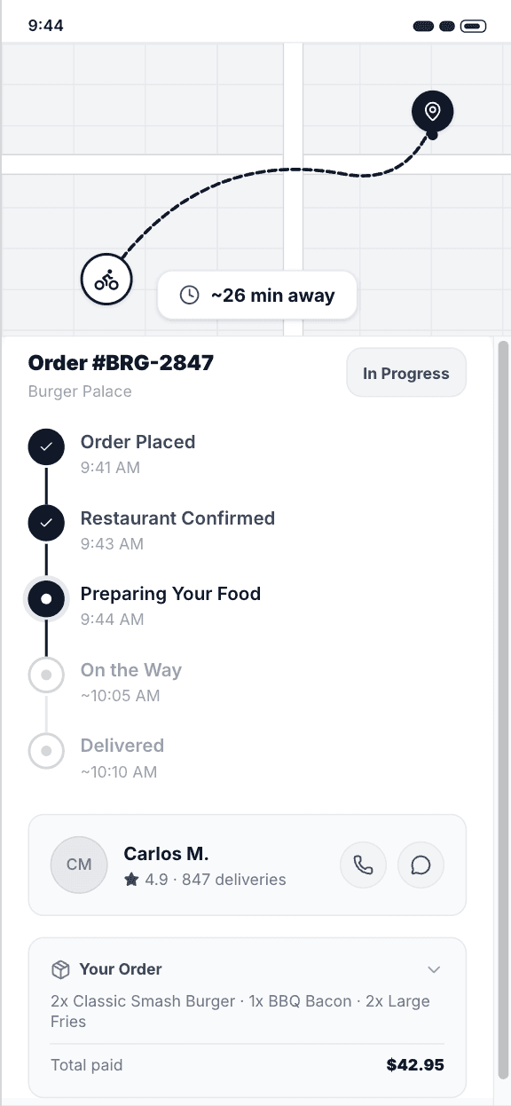
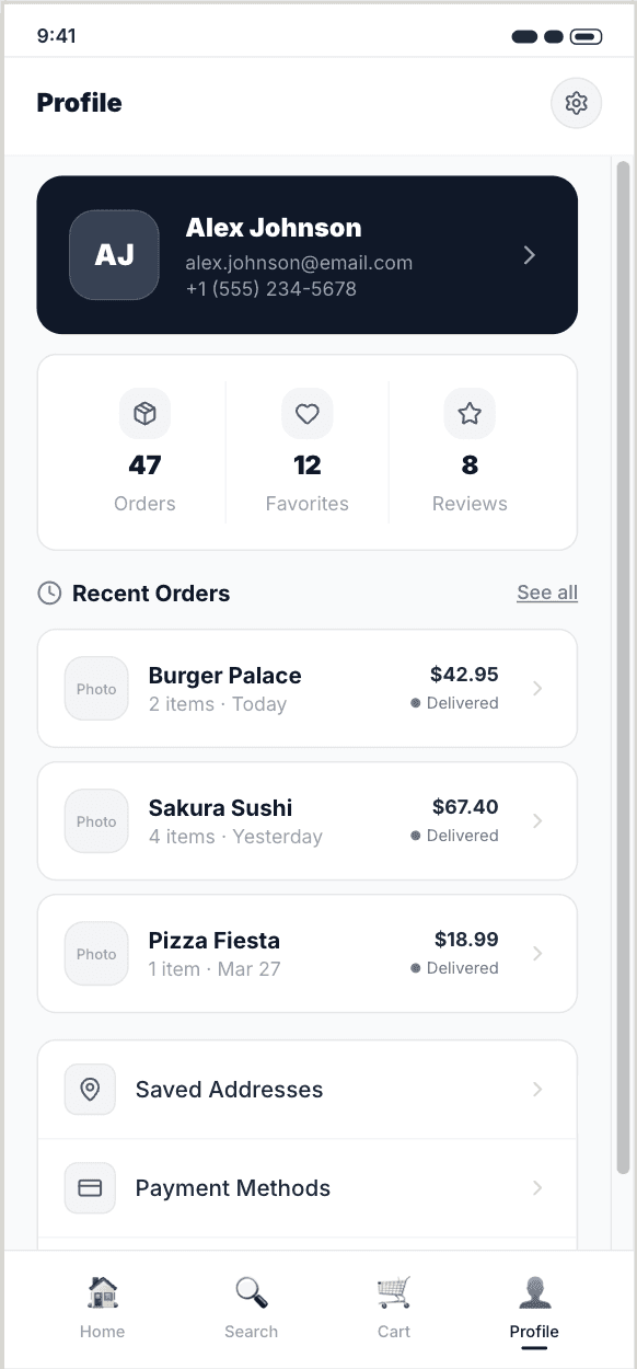
The final wireframes achieved an 89% task completion rate in structured walkthroughs, compared to 47% on the original app.
Visual Design
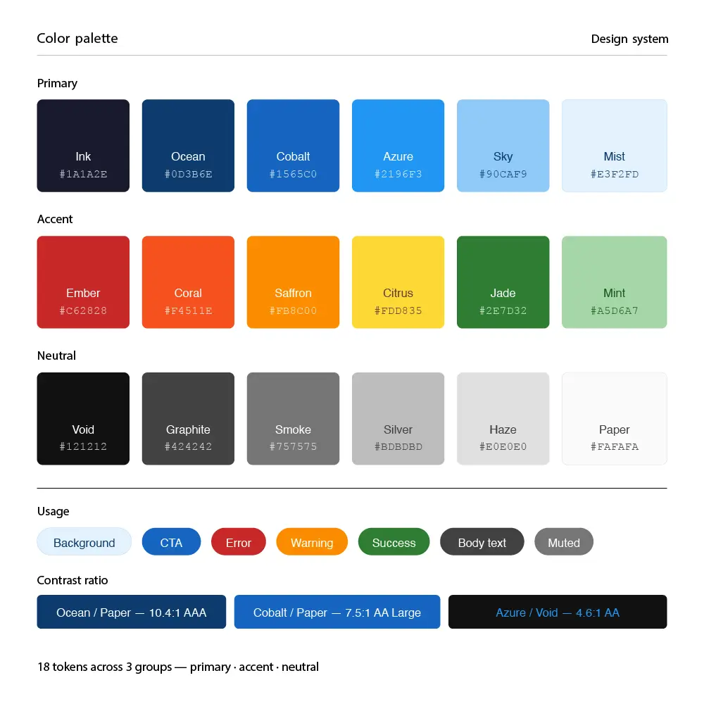
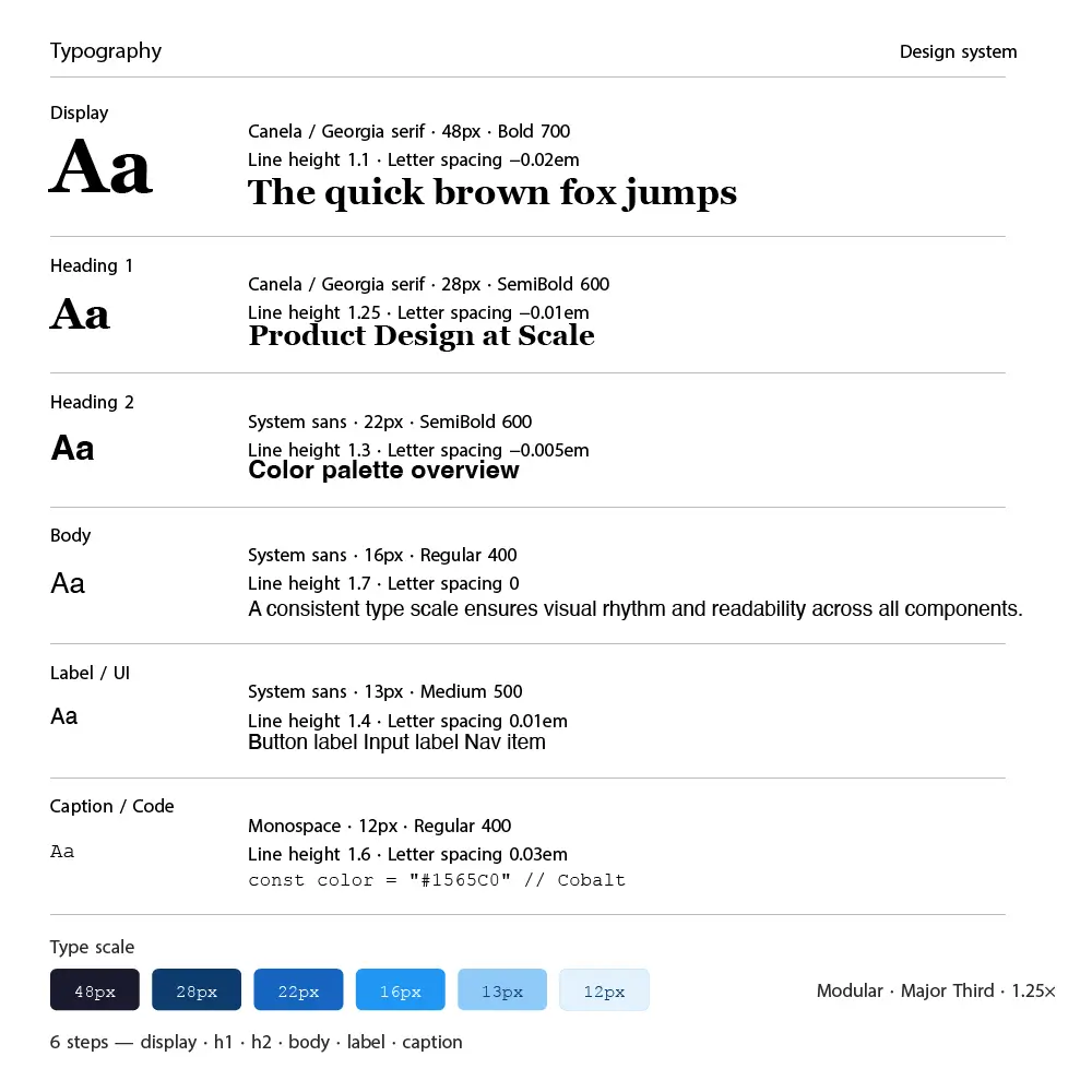
The visual direction needed to feel inspiring and aspirational while remaining fast and functional during active trip planning. I built a design system anchored in a deep ocean blue and warm sand palette, with a coral accent for calls to action and price highlights. Photography-forward cards with strong typographic hierarchy bring destination content to life without competing with functional UI elements.
Prototyping & Testing
I built a high-fidelity interactive prototype in Figma covering all 4 primary user flows and ran 4 rounds of moderated and unmoderated testing with 26 participants across solo traveler and group organizer personas using Maze for remote benchmark testing.
28 Test Participants 4 Testing Rounds 91% Task Success Rate
Iterations & Refinements
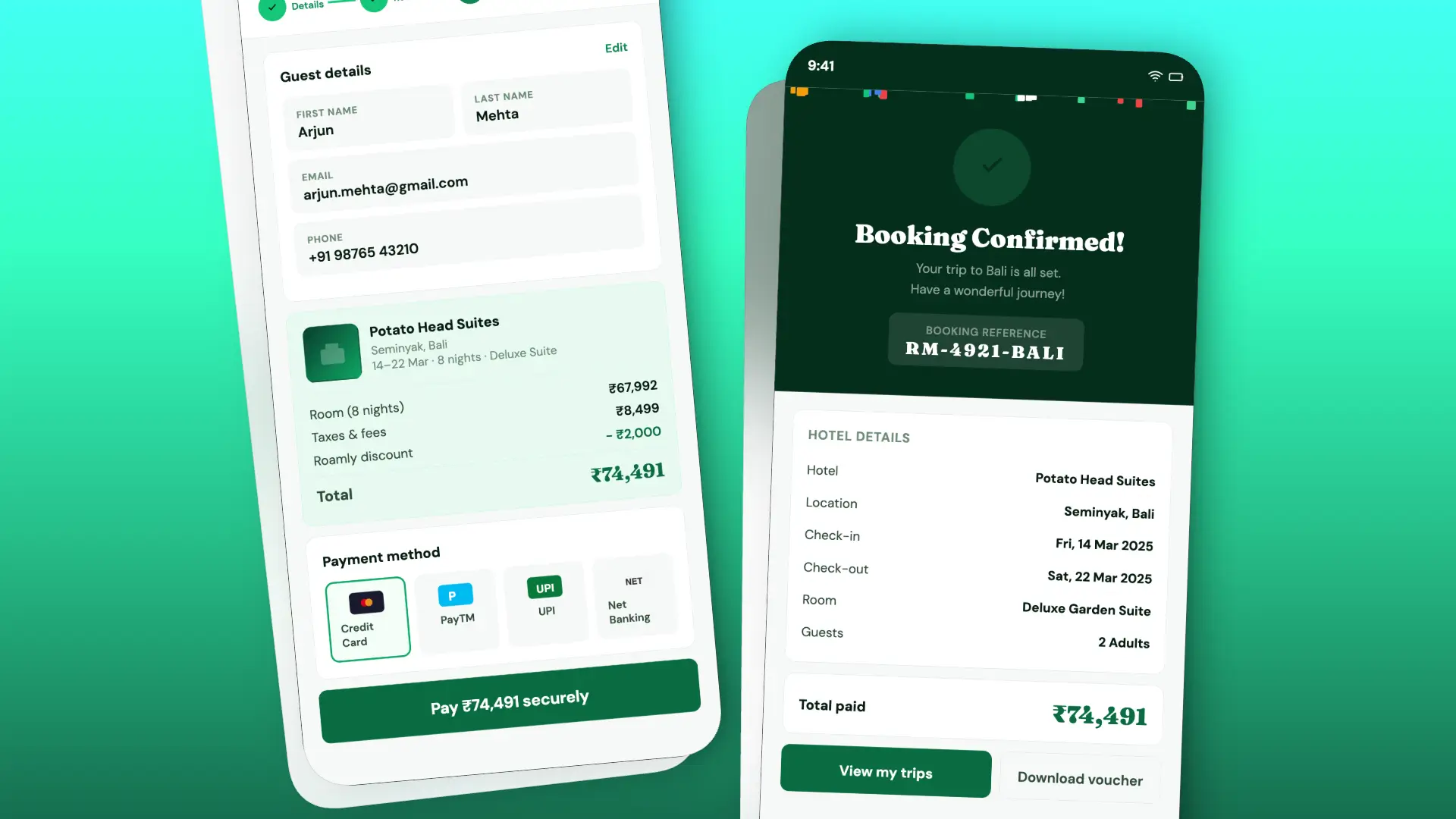
Iteration 1: Replaced the 9-step checkout with a 3-step flow using saved traveler profiles and pre-filled payment. Result: 54% reduction in checkout time and 38% increase in booking completion in beta testing.
Iteration 2: Added a collaborative trip board with real-time voting and cost splitting for group travelers. Result: Group session duration increased by 3.2x and group booking completion rate rose from 12% to 41%.
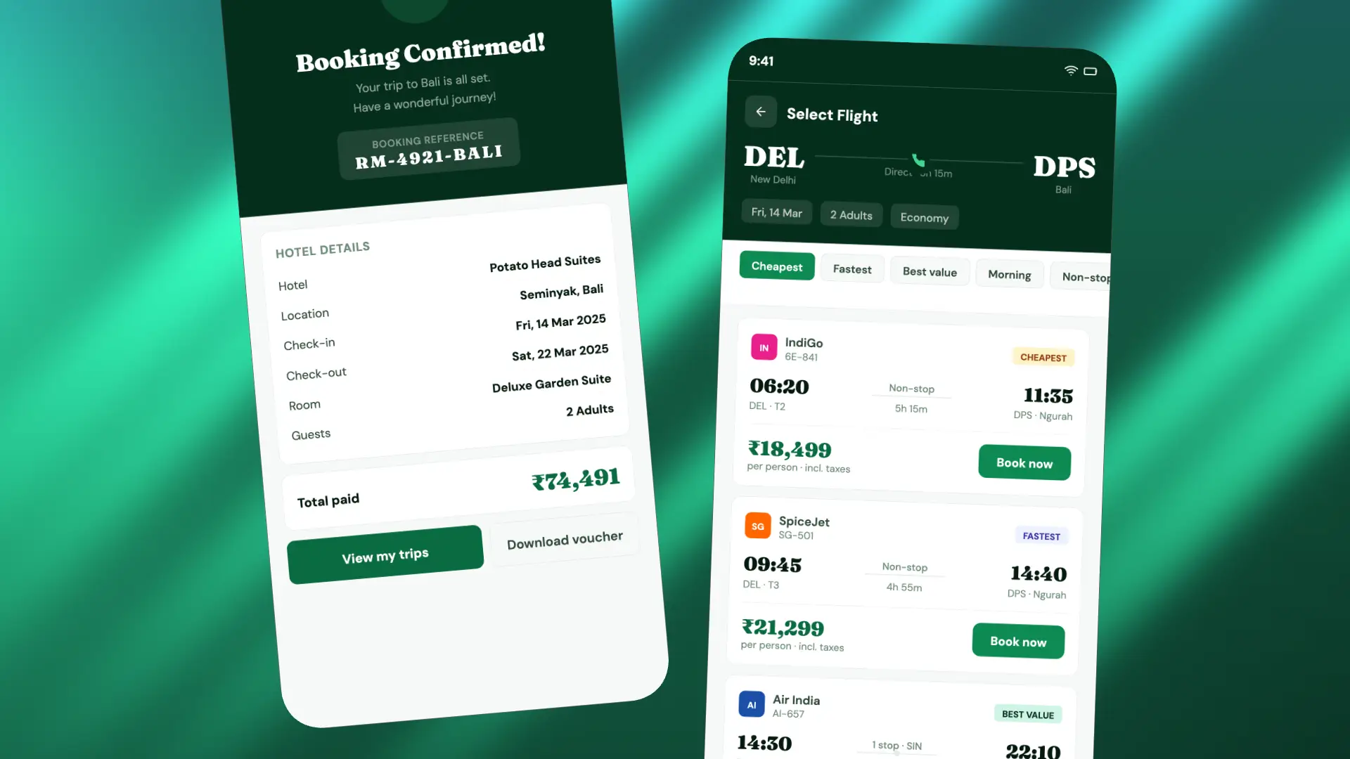
Final Design
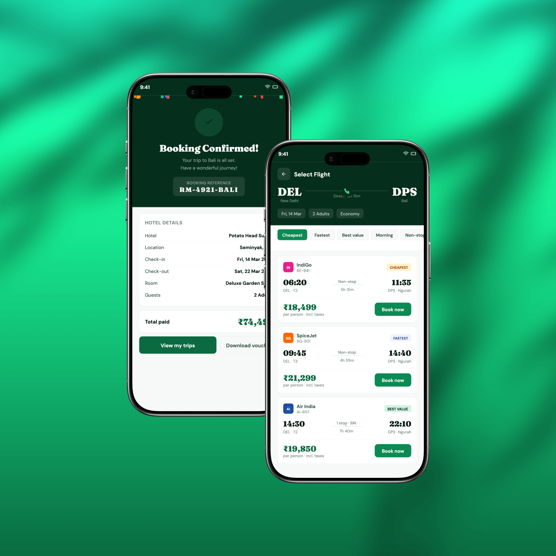
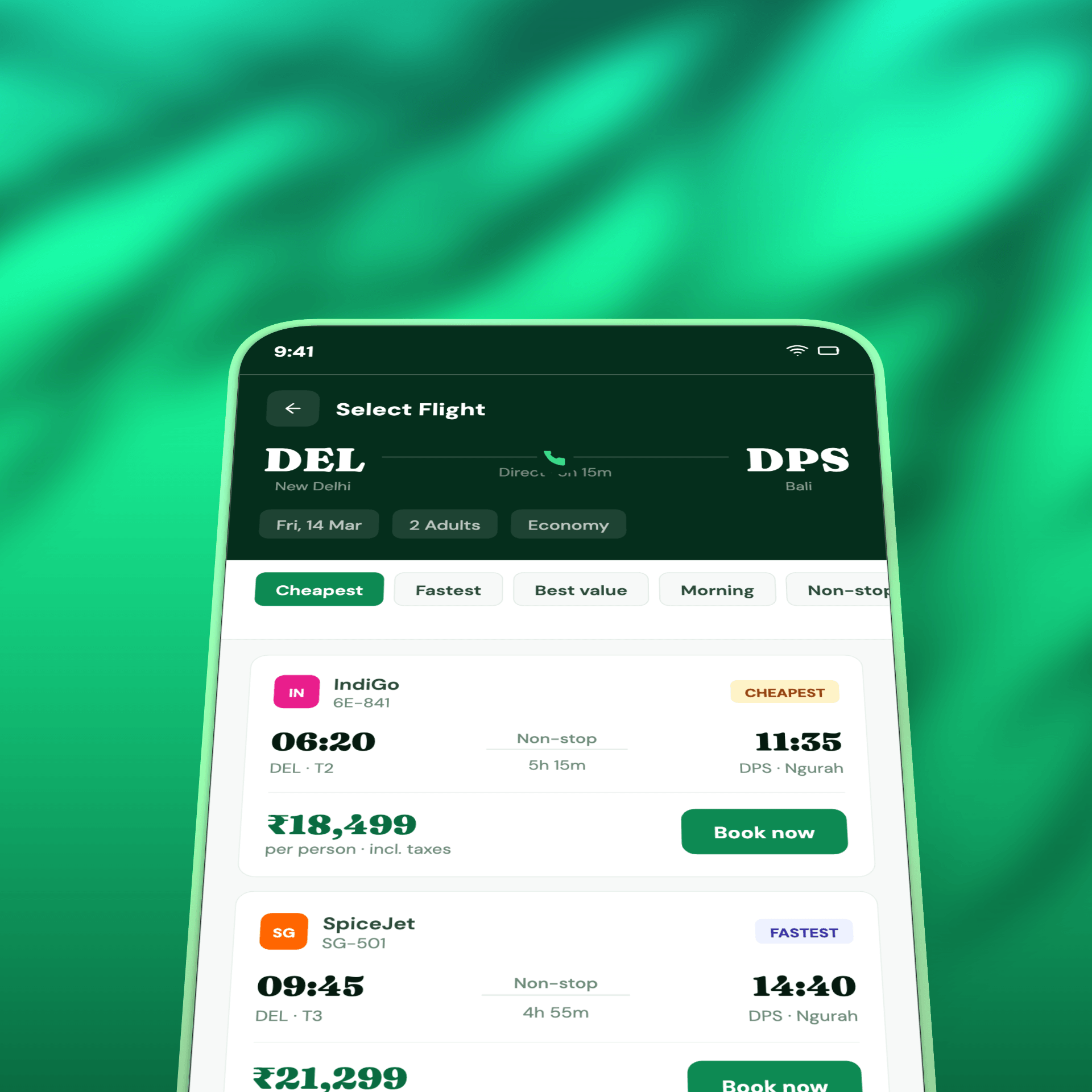
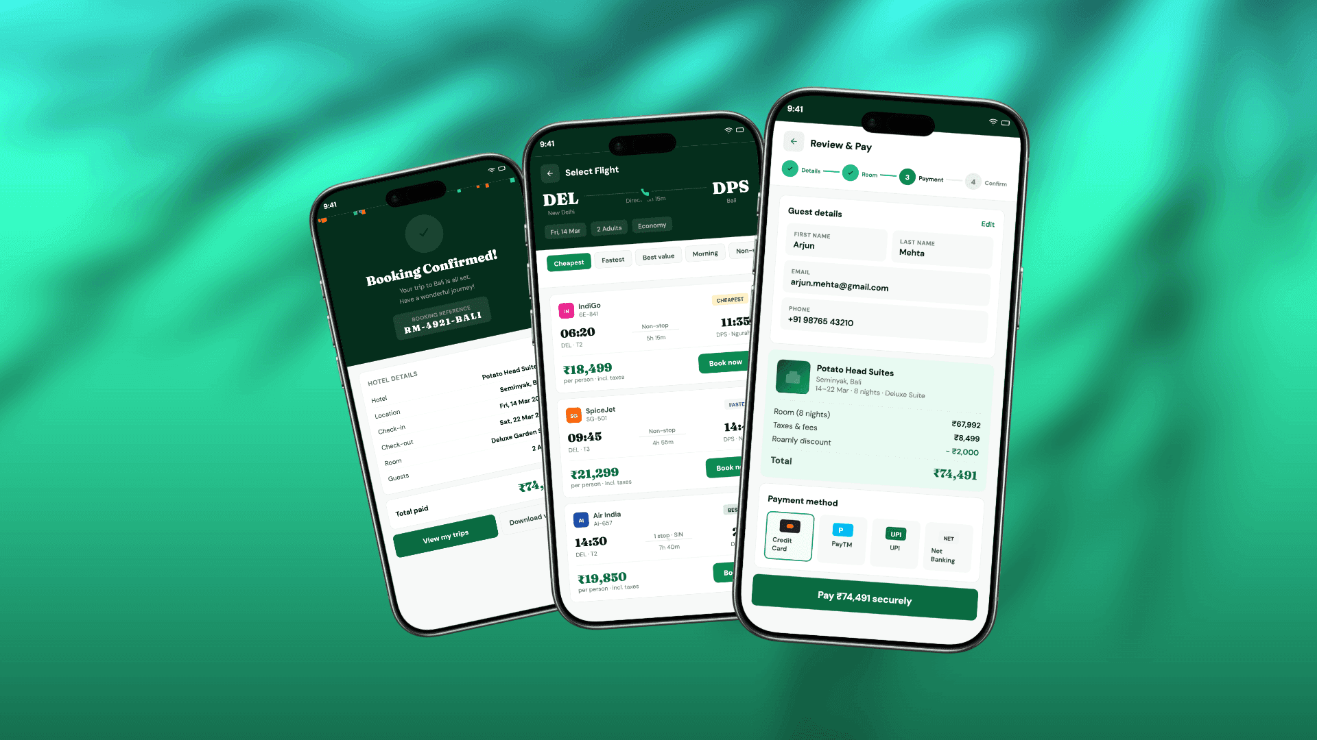
The final design, "WanderMode," delivers a personalized, inspiration-first travel planning experience that scales from solo weekend trips to complex multi-destination group itineraries. Key features include:
Travel style onboarding quiz that personalizes discovery, recommendations, and price filters
Smart destination feed with curated cards based on travel history and saved preferences
3-step booking checkout with pre-filled traveler profiles and one-tap payment
Collaborative trip board with real-time voting, shared itinerary, and cost split calculator
Post-booking trip hub with live flight status, hotel details, and local tips
Smart price alert system with personalized drop notifications based on saved searches
Full WCAG AA accessibility compliance with dynamic text sizing support
Impact
61% to 28% Booking abandonment rate improvement 3.6 to 4.7 App Store rating improvement 3.2x Increase in group session duration
"We had tried to fix the booking flow twice before. This redesign is the first time users have actually told us the app feels fun to use."
35%
Faster Planning
28%
More Itineraries
22%
Higher Bookings
18
Medium
Lessons Learned
Travel decisions are emotionally driven - design for inspiration first, transaction second
Personalization at onboarding pays compounding dividends across every downstream screen
Group travel is a massively underserved use case in most travel apps and a real differentiator
Pre-filling known information at checkout removes the single biggest friction point in booking
Photography quality inside the app directly impacts perceived trustworthiness and booking intent
Next Steps
Introduce AI-powered itinerary generation based on destination, duration, and travel style
Build a local experiences marketplace with curated guides from verified local creators
Develop a web companion app for pre-trip research and post-trip photo journaling
Run a 6-month longitudinal study measuring rebooking rate and lifetime value impact
Expand collaborative trip board to support corporate and team offsite travel use cases